| Author | Thread |
Comments Made During the Challenge  |
|
|
02/23/2003 11:50:45 AM |
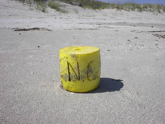
| This photo looks like it belonged on the set of Cast Away! I love it, it really does look "lost"! |
|
|
|
02/22/2003 09:02:50 AM |
| About the composition, I would try 1/3 to give the frame more space and relate to the title. |
|
|
|
02/20/2003 12:36:28 AM |
| good image, the yellow bouye seems small compared to the background and the background also seems a little cluttered |
|
|
|
02/18/2003 10:16:43 AM |
| I think adding this object to the photo sort of ruins it. It makes the object look totally out of place. The photo needs to be more natural looking. But it very clear and colorful. |
|
|
|
02/17/2003 06:59:33 PM |
| Looks a little lonely.... |
|
|
|
02/17/2003 01:56:19 AM |
| Pretty cool... You should have cranked on the yellow saturation a little more and possible cropped it a little closer. I like the grey sand with the yellow, nice "tone" to it. 7. |
|
Home -
Challenges -
Community -
League -
Photos -
Cameras -
Lenses -
Learn -
Help -
Terms of Use -
Privacy -
Top ^
DPChallenge, and website content and design, Copyright © 2001-2026 Challenging Technologies, LLC.
All digital photo copyrights belong to the photographers and may not be used without permission.
Current Server Time: 02/01/2026 05:34:32 AM EST.