| Author | Thread |
Comments Made During the Challenge  |
|
|
11/29/2004 06:45:33 PM |
| Not sure I'd want to enter if it wasn't abandoned either. |
|
 Photographer found comment helpful. Photographer found comment helpful. |
|
|
11/28/2004 03:02:38 PM |
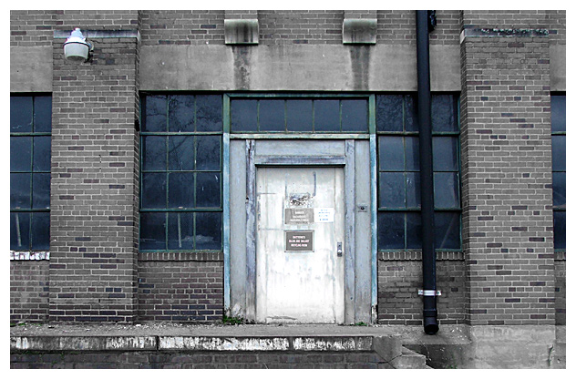
| Scary concept. I would have liked to been able to read the signs, so I would have cropped this closer and maybe had a face looking out from one of the windows to up the intensity. I was almost afraid to look too closely at the windows for fear that that is precisely what I would see. |
|
| Photographer found comment helpful. |
|
|
11/27/2004 11:55:05 PM |
Good use of selective desaturation. Makes the image rather spooky.
I don't think there is a strong connection to authority, more symbolic.
Technical: Sharpness, exposure, and contrast is good.
Artistic: Again, very tastefully executed. Good perspective and crop.
Overall: This is a great photo that unfortunately does not make a strong connection with the challenge theme. |
|
| Photographer found comment helpful. |
|
|
11/27/2004 12:09:20 PM |
| Very good... really like... nice done with half desaturation and blue toning of windows. |
|
| Photographer found comment helpful. |
|
|
11/24/2004 06:28:38 PM |
| a tighter crop, so we could read the signs might have been nice |
|
| Photographer found comment helpful. |
|
|
11/24/2004 04:07:07 AM |
| as i can't really read the sign, all i'm left with is an image of a door. does not really hit the challenge for me. |
|
| Photographer found comment helpful. |
|
|
11/23/2004 10:01:56 PM |
ROFL
so i'm assuming that the pysco ppl just said the hell with this and up and left.
nice shot well done i'm still having fun w/the thought
lol |
|
| Photographer found comment helpful. |
Home -
Challenges -
Community -
League -
Photos -
Cameras -
Lenses -
Learn -
Help -
Terms of Use -
Privacy -
Top ^
DPChallenge, and website content and design, Copyright © 2001-2025 Challenging Technologies, LLC.
All digital photo copyrights belong to the photographers and may not be used without permission.
Current Server Time: 04/08/2025 01:34:30 AM EDT.