| Author | Thread |
|
|
11/30/2004 10:06:51 PM |
| Hey there. Sorry for the poor finish. Sometimes a picture needs to be overblown to these massive proportions to convey a symbolic meaning. Better luck next time! |
|
|
|
11/30/2004 07:23:37 PM |
| Congrats on the brown. Nowhere to go but up. :o) |
|
Comments Made During the Challenge  |
|
|
11/29/2004 09:04:04 PM |
| Once again, another DPC Challenge entry has burned my retinas. :-( |
|
|
|
11/29/2004 02:21:00 PM |
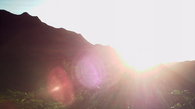
| To my taste, this is just too blown out above the horizon. Without a graduated neutral density filter, this is essentially an impossible shot. |
|
|
|
11/28/2004 06:51:51 PM |
| My previous comment was perhaps overly harsh. However, I don't get what this has to do with "Authority". Credit to you for not titling it "SUNRISE - THE ULTIMATE AUTHORITY" or something lame like that, though. Aesthetically, it doesn't really appeal to me - sorry. It's been done a hundred times, and done better at that. |
|
|
|
11/28/2004 06:28:59 PM |
| my eyes! my eyes! Be careful when pointing to the sun, it might mess up the camera gear. |
|
|
|
11/28/2004 07:05:33 AM |
| I don't really see the connection between your photo and Authority. It's also not the most interesting sunrise photo. I am assuming that the flare is intentional, but it is really not enhancing this photo for me. Also, the bright spot where the sun is actually hurts my eyes. When I vote, the challenge topic is a small part of my score. I usually look at the overall compositon of the photo as well as the technical aspects and overall appeal. Based on these, I have to give you a 4. |
|
|
|
11/28/2004 06:47:21 AM |
| This image needs some work. The brilliant light could work as your message, but it is too overwhelming and messy. |
|
|
|
11/28/2004 04:36:38 AM |
| Nice idea. To improve on a shot like this, I'd suggest a shorter exposure, and a lens hood to cut down on the glare. |
|
|
|
11/25/2004 10:12:04 AM |
| Don't like the picture because it's nothing but glare and what does this have to do with Authority? |
|
|
|
11/25/2004 07:25:35 AM |
| The sun is so bright that it degrades the lines. It seems that it was a mistake instead of an intentional composition. The flare isn't helping to offset that opinion. |
|
|
|
11/25/2004 12:33:18 AM |
|
|
|
11/25/2004 12:29:13 AM |
| I don't know if it was your intent, but it seems a bit blown out to me. |
|
|
|
11/24/2004 05:37:16 PM |
|
|
|
11/24/2004 02:10:48 PM |
| I have trouble associating your image with the challange... Sorry |
|
|
|
11/24/2004 09:34:10 AM |
| ouch, waaaaay too bright. |
|
|
|
11/24/2004 07:55:34 AM |
| Uh, sorry? What has this got to do with authority? Okay, not considering that, there still lack the details in the mountains and the sun is too strong. |
|
|
|
11/24/2004 07:30:46 AM |
| It's so blown out you can't really see that it's a sunrise. |
|
|
|
11/24/2004 04:16:27 AM |
| ay-yi-yi...this is blinding. can't really offer much here except to say i hope this didn't hurt you when you took it... |
|
|
|
11/24/2004 12:29:54 AM |
|
|
|
11/23/2004 08:55:12 PM |
I think the sun in this shot literally outshines everything. Quite powerful, I see the connection with the challenge theme. I'm bumping this one up. 5
|
|
|
|
11/23/2004 08:23:01 PM |
| With the massive over-exposure of hte sky, and lens flare, I hardly see anything else inthis picture. Not good. Also, I don't see it's relation to the topic. |
|
Home -
Challenges -
Community -
League -
Photos -
Cameras -
Lenses -
Learn -
Help -
Terms of Use -
Privacy -
Top ^
DPChallenge, and website content and design, Copyright © 2001-2025 Challenging Technologies, LLC.
All digital photo copyrights belong to the photographers and may not be used without permission.
Current Server Time: 04/06/2025 11:03:52 PM EDT.