| Author | Thread |
|
|
09/09/2005 04:48:42 AM |
| good pose, and better than, lighting. |
|
|
|
03/08/2005 12:47:49 PM |
gorgeous photo - the best of yours i have seen - and i've looked at most of them...
|
|
|
|
12/12/2004 12:41:42 AM |
| Natural or not, I really like the pose. It works well with the lighting and compliments your model's form. This is a beautiful photo. |
|
|
|
11/24/2004 12:34:24 AM |
|
Comments Made During the Challenge  |
|
|
11/22/2004 11:17:41 PM |
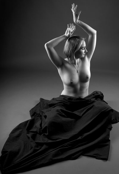
| I would either zoom in or zoom out here. Seems a little bit too tight on 3 out of 4 sides. Probably zoom in. Otherwise excellent. |
|
|
|
11/21/2004 11:51:38 PM |
| Excellent lighting and interesting pose. 9 |
|
|
|
11/20/2004 07:08:36 PM |
| Pose seems unnatural, nice lighting. |
|
|
|
11/20/2004 02:06:41 PM |
| very good photo, good use of lighting. I would have liked to see you use the full 640 for the height. |
|
|
|
11/19/2004 02:01:20 AM |
| The lighting, detail, focus, exposure, and framing is good. Her pose is rather unnatural and quite frightening, however. |
|
|
|
11/19/2004 12:27:18 AM |
|
|
|
11/18/2004 08:59:28 PM |
|
|
|
11/18/2004 01:56:10 PM |
| Great lighting!!, pose looks a little forced and awkward, the black sheet is a bit distracting since i see it playing no major role in the composition and occupies much of the frame 7 |
|
|
|
11/18/2004 11:41:54 AM |
| Now where did I see that before?? LOL |
|
|
|
11/18/2004 09:26:06 AM |
| for some reason I see green in this shot.. |
|
|
|
11/18/2004 08:47:19 AM |
| I like the wide range of shades in this shot. I think the lighting was very nice. I think the black sheet on the subject makes an interesting contrast to the much lighter bottom half of the shot. |
|
|
|
11/18/2004 03:03:11 AM |
| The full range of shades, deep black to bright white and nothing missing in the middle, yet masterfully contrasted. Unique pose, absense of distracting shadows. This is a winner. 10. Good luck! (I hope you do a print version of this.) |
|
|
|
11/17/2004 04:11:09 PM |
| Very nice lighting. It almost looks in some spots like she has silver body paint. The background isn't distracting and the dark cloth is something a little different and lit well to catch some of the folds and highlights. Maybe lose the necklace? Great shot. |
|
|
|
11/17/2004 03:49:31 PM |
|
|
|
11/17/2004 02:32:19 PM |
| a bit too much light. Nice pose |
|
|
|
11/17/2004 06:31:40 AM |
| Absolutely beautiful model, and very nicely executed photo, especially the lighting. |
|
|
|
11/17/2004 12:28:30 AM |
| Just a wonderful picture love the way you played with lights and i like her pose, it gives an oriental feel. Great job. |
|
|
|
11/17/2004 12:21:40 AM |
| When I first opened the image I thought there was some nice soft lighting and an interesting pose but after looking for a while I find it a little awkward. Her position on the floor and the sheet over her lower half just doesnt look natural and I dont think it adds anything to the shot. Personally, I would rather see a closer shot with the image cropped to the middle instead of there being a lot of negative space around the focal point - her. |
|
Home -
Challenges -
Community -
League -
Photos -
Cameras -
Lenses -
Learn -
Help -
Terms of Use -
Privacy -
Top ^
DPChallenge, and website content and design, Copyright © 2001-2026 Challenging Technologies, LLC.
All digital photo copyrights belong to the photographers and may not be used without permission.
Current Server Time: 02/01/2026 10:12:58 AM EST.