| Author | Thread |
Comments Made During the Challenge  |
|
|
11/23/2004 05:53:27 PM |
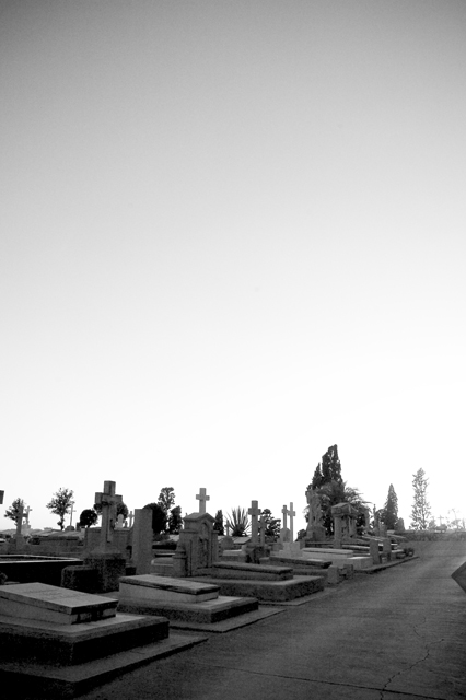
| Very powerful photograph! Just makes me think of desolation (a lonely existence after live). Great use of the sky, really adds to the whole atmosphere of the photo. Crossroads, I�m not sure that title works for me but it�s about the photo and that�s high marks from me. This must be shot in Europe as here we don�t see graves sites like that. The only thing that I might have changed is a little more crop on the right hand side to take out the triangle shape that�s a little distracting. |
|
|
|
11/23/2004 02:51:08 PM |
| So glad that some folks aren't afraid to use negative space. I like the comp. The subject's a little dark, not showing much detail. The little triangle on the side is a bummer. |
|
|
|
11/23/2004 07:36:28 AM |
| consider cropping the sky some ... |
|
|
|
11/22/2004 09:34:10 PM |
| Well, once you get past the punny title...Its a really good shot. Nice contrast, nice angle, dynamic, clear, and I like the negative space. |
|
|
|
11/22/2004 06:46:12 AM |
| i would have liked it more with a tighter crop |
|
|
|
11/22/2004 06:20:56 AM |
Very interesting... that isn't in Heywood is it :P
Well done! |
|
|
|
11/21/2004 03:46:53 PM |
| Nice job with the tombstones and perspective here. I'm sure all the negative space on the top is there for a reason, but I guess I don't share your vision. but still a 6 |
|
|
|
11/21/2004 06:31:56 AM |
| I like the space given topside and great tones. |
|
|
|
11/20/2004 03:52:08 PM |
| Dramatic use of empty space -- great job! |
|
|
|
11/19/2004 09:57:02 AM |
| I think there is way too much sky, but a good picture. |
|
|
|
11/18/2004 12:23:46 PM |
Great use of "white" space... but the subject is .....boring or not of interest, IMO. Also what is the hint of something there on the right border? Still giving you a 5.
|
|
|
|
11/18/2004 04:33:02 AM |
| i see color in the sky, why? |
|
|
|
11/17/2004 07:24:22 PM |
|
|
|
11/17/2004 01:46:19 PM |
| Don't quite understand the tite (unless crossroads as in roads of crosses). Nice use of negitive space, love the fade from white to black. |
|
|
|
11/17/2004 04:22:16 AM |
| The big sky really helps thi spicture. |
|
|
|
11/17/2004 03:35:21 AM |
| There is and object to the right that is a bit didstracting, but other then that great photo |
|
|
|
11/17/2004 01:50:42 AM |
| i like the photo, but why so much space on the upper half? |
|
|
|
11/16/2004 09:49:11 PM |
| Very nice photo but it has too much space at the top. Cropping would help. |
|
|
|
11/16/2004 08:36:55 PM |
| Too much air for my taste |
|
Home -
Challenges -
Community -
League -
Photos -
Cameras -
Lenses -
Learn -
Help -
Terms of Use -
Privacy -
Top ^
DPChallenge, and website content and design, Copyright © 2001-2025 Challenging Technologies, LLC.
All digital photo copyrights belong to the photographers and may not be used without permission.
Current Server Time: 04/08/2025 08:09:19 AM EDT.