| Author | Thread |
|
|
02/21/2003 03:36:16 PM |
Greetings from the critique club.
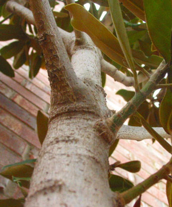
Composition: This is a very centered photo but I think it works in this case. I think if you removed the two leaves near the top center it would have shown more of the tree and more importantly the perspective of the tree. The brick background is a little distracting but you might not have had any other choice.
Technical: The bottom of the tree seems out of focus. Using a wider depth of field would have fixed that. Also the colors seem a little drab. Maybe in your photo editor you could have bumped up the contrast or levels a bit.
Overall: This is a good perspective shot and with a little pre-shot grooming of the tree and a little photo editing would have helped place this shot higher. |
|
Comments Made During the Challenge  |
|
|
02/14/2003 11:34:57 PM |
| I don't get the title. The photo is kind of nice. I like the blurring of the tree trunk bringing my eyes further up towards the branches. Overall, the composition is nice, and the light is decent. The colours are a little washed out. |
|
|
|
02/13/2003 11:54:35 AM |
| Focus is a limited DOF, but good in the middle of the photo. The leaves seem to hide much of the perspective part. It doesn't look like a "good" tree to climb. Color seems a tad diminished, but not bad. 6 Swash |
|
|
|
02/12/2003 04:26:00 PM |
| Only thing is the brick wall ruins the illusion of height of the tree. |
|
|
|
02/10/2003 05:51:01 PM |
| Seems a bit soft on the focus. Looks like a nice climbing tree. |
|
Home -
Challenges -
Community -
League -
Photos -
Cameras -
Lenses -
Learn -
Help -
Terms of Use -
Privacy -
Top ^
DPChallenge, and website content and design, Copyright © 2001-2025 Challenging Technologies, LLC.
All digital photo copyrights belong to the photographers and may not be used without permission.
Current Server Time: 04/07/2025 01:04:39 PM EDT.