| Author | Thread |
|
|
12/12/2004 03:30:43 AM |
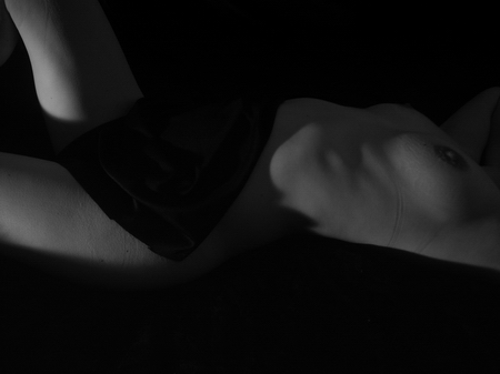
| Wow, tough crowd! The darkness doesn't bother me, but eliminating the bra lines (this photo's only distraction) would improve it. Still, I believe this one deserved a much higher score. |
|
 Photographer found comment helpful. Photographer found comment helpful. |
|
|
11/24/2004 11:02:10 AM |
| Must adjust my monitor at home,Looks far better here at work, deserved a higher placing than this. |
|
| Photographer found comment helpful. |
Comments Made During the Challenge  |
|
|
11/23/2004 06:45:54 PM |
| could use a little more range of light |
|
| Photographer found comment helpful. |
|
|
11/23/2004 11:46:37 AM |
| good idea....but way too dark. |
|
| Photographer found comment helpful. |
|
|
11/23/2004 01:21:09 AM |
|
| Photographer found comment helpful. |
|
|
11/21/2004 05:23:31 AM |
| Almost too dark...an interesting shot, none the less. |
|
| Photographer found comment helpful. |
|
|
11/20/2004 10:05:13 AM |
| I cannot make out what it is, a little dark. |
|
| Photographer found comment helpful. |
|
|
11/20/2004 08:30:33 AM |
| This could have been a good photo but it is very dark, looking at the histogram there are no pixel higher then 150. It is also much smaller then it could be. I might also be a good idea to give your model just a bit more time without the bra so that the lines from it are not so visible. I do like the play of light and shadow. |
|
| Photographer found comment helpful. |
|
|
11/20/2004 03:26:52 AM |
| could be so much better with more contrast |
|
| Photographer found comment helpful. |
|
|
11/19/2004 04:18:29 PM |
| I want more contrast, rather than just the grey. |
|
| Photographer found comment helpful. |
|
|
11/19/2004 02:00:54 PM |
| This photo is to dark for me to make out what is going on in the photo. |
|
| Photographer found comment helpful. |
|
|
11/19/2004 08:39:22 AM |
|
| Photographer found comment helpful. |
|
|
11/19/2004 08:08:34 AM |
| Maybe a little too dark, and she has bra lines on her skin. Great pose and composition though. |
|
| Photographer found comment helpful. |
|
|
11/19/2004 03:06:04 AM |
| It´s just way too dark for my taste, 90% of the image is pretty much pitch black and only a small fraction of herright legis lit. If you are making it dark to not put anything on display you should perhaps tried a technique callend "painting with light" to give you more control over what parts are dark and what parts are bright. If you are unfamiliar with this technique, send me PM after the challenge is over and I will gladly assist you. |
|
| Photographer found comment helpful. |
|
|
11/18/2004 11:02:29 PM |
| Very intriguing photo and well composed. It took me a whil 'till I figured that the center part isn't a shadow but a towel (very nicely done). The only thing that bugs me are the stripes from underware, if shot only 5min later this would have been perfect... |
|
| Photographer found comment helpful. |
|
|
11/18/2004 07:48:22 PM |
|
| Photographer found comment helpful. |
|
|
11/18/2004 06:52:28 PM |
| It may be my eye but the reletively narrow range of values doesn't seem intentional. |
|
| Photographer found comment helpful. |
|
|
11/18/2004 05:50:04 PM |
| Compostionally, It's too centered vertically for my tastes. Technically, the bra line is a distraction. |
|
| Photographer found comment helpful. |
|
|
11/18/2004 05:36:20 PM |
| I just recalibrated my monitor to see if that was the culprit. Nope. This is too dark fro me to see anything but three amorphous shapes. Fine abstract though. |
|
| Photographer found comment helpful. |
|
|
11/18/2004 04:32:04 PM |
| This would be much more effective if there was a greater sense of black and white, rather than black and not so black, but nice idea. |
|
| Photographer found comment helpful. |
|
|
11/18/2004 12:25:10 PM |
| Very pretty, I would like more whites... |
|
| Photographer found comment helpful. |
|
|
11/18/2004 12:21:48 PM |
| A bit too dark. I think if it was not soo dark the shadows would be very effective. Also, the horizontal placement of subject is probably not the most interesting composition!! But, good idea. |
|
| Photographer found comment helpful. |
|
|
11/17/2004 07:22:02 PM |
| I like the dark tones and the negative space at the bottom. I am less sure of the crop you chose at the right. Personally, I think the head would have been good here, or at least the neck. More significantly however, the subject has lines from their clothes that are distracting to the tones and texture of the skin. Your model needs to avoid tight fitting underwear the day of the shoot. |
|
| Photographer found comment helpful. |
|
|
11/17/2004 04:30:27 PM |
| I like the total look, I would suggest that you have your model get undressed a bit before the shoot, to allow for underwear lines to dissapear. |
|
| Photographer found comment helpful. |
|
|
11/17/2004 04:14:41 PM |
| Good shade and framing. Butit's just way to dark for me. Not sure I understand the title either (but that doesn't really count.) If lightened, yo might need to reduce contrast slightly to keep the far leg in the "gray zone". Did you have your computer screen turned up high brightness in low light perhaps? it's so easy to do with black and white images. What a shame. 6. |
|
| Photographer found comment helpful. |
|
|
11/17/2004 02:21:30 PM |
|
| Photographer found comment helpful. |
|
|
11/17/2004 02:15:01 PM |
| Not too much of the grayscale. Too dark on the grayscale. The braline also takes away from the image as a whole. |
|
| Photographer found comment helpful. |
|
|
11/17/2004 11:46:30 AM |
| A bit dark, took me a few seconds and viewing the screen from many postitions before I found out what it is. Still can't figure the whole frame out. |
|
| Photographer found comment helpful. |
|
|
11/17/2004 05:42:04 AM |
| Should have waited a little to let the strap marks go away. |
|
| Photographer found comment helpful. |
|
|
11/17/2004 03:19:18 AM |
| very dark, i cant quite tell what it is |
|
| Photographer found comment helpful. |
|
|
11/16/2004 07:35:22 PM |
| I think this needs to be a bit brighter to help bring out the form a bit more. Also the bra marks on the skin are distracting. Still a nice photo (6) |
|
| Photographer found comment helpful. |