| Author | Thread |
Comments Made During the Challenge  |
|
|
11/23/2004 10:44:46 PM |
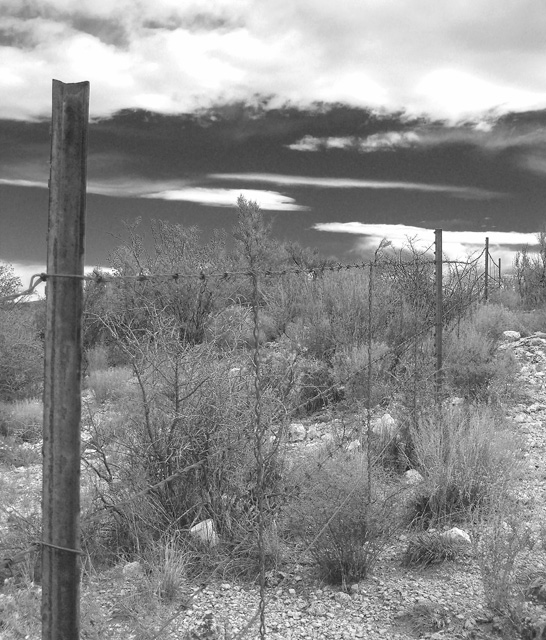
Nice shot and very nice DOF here. This photo reminds me of a True Australian Story called 'The Rabbit Proof Fance'.
|
|
 Photographer found comment helpful. Photographer found comment helpful. |
|
|
11/23/2004 11:29:07 AM |
|
|
|
11/23/2004 12:36:52 AM |
| Try this again with a higher contrast |
|
| Photographer found comment helpful. |
|
|
11/22/2004 10:30:48 PM |
| I like the sky ... but the plants in the background just sort of "blend into the sky" with little separation. I doubt the colors were similar ... so my guess is that performing your color-to-b&w conversion with Channel Mixer or something similar could have resulted in a much more compelling b&w. If you'd like me to explain more after the challenge is over, send me a PM. |
|
| Photographer found comment helpful. |
|
|
11/22/2004 09:51:53 AM |
| So little contrast goes well with lazy feeling. Quite used subject, but sky and unusual location makes it an image anyway. |
|
| Photographer found comment helpful. |
|
|
11/21/2004 04:44:37 PM |
| Great!! Totally Awesome, an 8! |
|
| Photographer found comment helpful. |
|
|
11/21/2004 01:15:55 AM |
| The fence leads the eye nicely through the image but there seems to be a lack of contrast in the image. The full tonal range doesnt look present and so the image seems very light and so a little indistinguished. Adding more contrast would define certain areas of the image and give it a little more tonal depth. |
|
| Photographer found comment helpful. |
|
|
11/20/2004 08:25:17 PM |
| Nice subject in an interesting setting. |
|
| Photographer found comment helpful. |
|
|
11/20/2004 02:18:15 PM |
| Fences can be alluring, can't they? |
|
| Photographer found comment helpful. |
|
|
11/20/2004 03:40:16 AM |
| With the level of contrast the fence gets lost in the scrub, bring the fence out. Perhaps this shot would work in color. |
|
| Photographer found comment helpful. |
|
|
11/19/2004 11:05:43 PM |
| I like the feeling of desolation here. The sky is different enought to make it good. |
|
| Photographer found comment helpful. |
|
|
11/19/2004 11:24:25 AM |
Nice picture. I think it would look better if it had a more contrast.
June |
|
| Photographer found comment helpful. |
|
|
11/19/2004 08:33:09 AM |
| maybe a bit darker, seem to be a little overblown. |
|
| Photographer found comment helpful. |
|
|
11/18/2004 06:01:40 PM |
| You're losing too much fence in the brush. Perhaps color would've popped this photo? A good concept, but it's getting lost. |
|
| Photographer found comment helpful. |
|
|
11/18/2004 04:43:13 PM |
| I like the composition. It just appears a little too gray rather than b&w. |
|
| Photographer found comment helpful. |
|
|
11/17/2004 11:42:41 PM |
| nice shot i lov the comp. and the sky in this shot |
|
| Photographer found comment helpful. |
|
|
11/17/2004 07:17:58 PM |
| The sky is really interesting. I like the different perspective. |
|
| Photographer found comment helpful. |
|
|
11/17/2004 06:42:41 PM |
It looks like you were going for a IR type look. I would like to see more black in the image. Nice z axis usage of the fence. 7
Image viewed on professional calibrated/color graded monitor set to Web Gamma range. |
|
| Photographer found comment helpful. |
|
|
11/17/2004 11:44:30 AM |
| Photo is a bit busy, could use more contrast - tones are somewhat flat. |
|
| Photographer found comment helpful. |
|
|
11/17/2004 09:16:33 AM |
| It seems like this image needs some punch, possibly increasing the contrast would help? |
|
| Photographer found comment helpful. |
|
|
11/17/2004 01:07:44 AM |
| I don't know if you have the abllity to use curves, but the foreground looks a little bright and sky looks a little dark. Nice use of leading lines. |
|
| Photographer found comment helpful. |
|
|
11/17/2004 12:31:58 AM |
| this is a really great image, i think just a little more contrast would have really brought out some more tones |
|
| Photographer found comment helpful. |
|
|
11/17/2004 12:16:17 AM |
| I believe this photo lacks enough contrast to make it particularly appealing... |
|
| Photographer found comment helpful. |
Home -
Challenges -
Community -
League -
Photos -
Cameras -
Lenses -
Learn -
Help -
Terms of Use -
Privacy -
Top ^
DPChallenge, and website content and design, Copyright © 2001-2026 Challenging Technologies, LLC.
All digital photo copyrights belong to the photographers and may not be used without permission.
Current Server Time: 02/01/2026 09:36:20 AM EST.