| Author | Thread |
|
|
02/12/2003 01:48:58 PM |
Greetings from the Critique Club :)
Hi Xertion...
Flowers made a great choice for the Cliche challenge... 'Cliche' is such a dirty word.. lol.. I love flower photos and I make a few myself. I plan to make a lot more in the spring since I have a renewed interest in that particular subject.
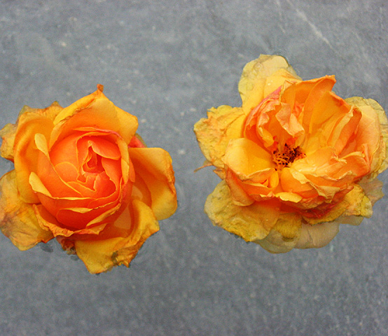
Floating these flower blossoms in the pool was a great idea... I have seen it done before so that could possibly add to the cliche concept. Compositionally, I think this photo could have more impact if the flowers were in a diagonal orientation with each other and possibly be set against a darker background. A darker environment around the flowers would create a lot of extra contrast to make the color of the blossoms really hit hard. Having them a little closer together could also help a bit... I don't see any real advantage of having each of them clipped by the sides of the frame...
Keep up the good work :)
John Setzler
|
|
 Photographer found comment helpful. Photographer found comment helpful. |
|
|
02/09/2003 07:12:05 PM |
| I like the way these flowers are just hanging in like suspended animation |
|
| Photographer found comment helpful. |
Comments Made During the Challenge  |
|
|
02/07/2003 03:46:58 AM |
| Love the constrast between the two flowers. Wish the one on the left had the bad petals pulled off and leave the one on the right as is. Nice background for this shot. Add to the shot well. Too tightly cropped on the sides. Like the cropping on the top and bottom. Of course you know all of our comments are really just our personal opinions, more than photographic techology. You can't help but have your personal likes and dislikes from entering in. From a technical standpoint, I think you did very well. Technical and personal added together gives this a 6. |
|
| Photographer found comment helpful. |
|
|
02/05/2003 01:47:33 PM |
| Very unique photo. I like brightness against the gray background. Good job. |
|
| Photographer found comment helpful. |
|
|
02/04/2003 02:27:10 PM |
|
|
|
02/03/2003 03:18:22 PM |
| I like the way the flowers appear to be floating over the background. I don't think there is enough contrast between the petals and the background though, also the flowers look a little weathered. |
|
| Photographer found comment helpful. |
|
|
02/03/2003 03:02:03 PM |
|
|
|
02/03/2003 11:21:27 AM |
| very pretty colors. nice focus, but, for my liking, cropped a little too closely on the sides. |
|
| Photographer found comment helpful. |
|
|
02/03/2003 10:03:25 AM |
| these seem to be floating no where. perhaps if they were grounded more they would create more interest. nice detail in the flower pedals! |
|
| Photographer found comment helpful. |
Home -
Challenges -
Community -
League -
Photos -
Cameras -
Lenses -
Learn -
Help -
Terms of Use -
Privacy -
Top ^
DPChallenge, and website content and design, Copyright © 2001-2025 Challenging Technologies, LLC.
All digital photo copyrights belong to the photographers and may not be used without permission.
Current Server Time: 04/07/2025 12:44:50 PM EDT.