Greetings from the Critique Club
By Inspzil
Lucky you Carsten!!
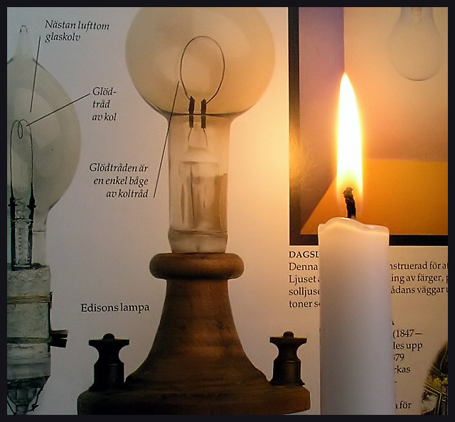
Composition - A diagram of a light bulb and a candle - I really like the idea. I can't read the diagram at all, but I definitely know that's what it is. I think the only hangup I have about the composition is actually the placement of the book and the candle. Living in left-to-right society, seems the before should be on the left. That part is strictly personal preference. The candle I think would be better served further left, and maybe move the book left a bit. The bulb shown on the top right is barely visible, but the two on the left side are very visible. I'd have put the furthest left bulb in full view and left the text part on the right side totally out of the pic (or mostly at least). Another suggestion that goes way beyond the in-depth critique part of my analysis is laying the book down in a position where someone might actually read it, perhaps even over someones shoulder with the candle in front of it as it would've been read in pre-electric lamp times. There is a lot you can do with these items, and I'm mad I didn't think of it! :) Good Composition overall though
Photography - It might be a pinch overexposed just because the candle's flame is getting a little wider than we would normally see it. It might have been a calculated risk though in lieu of having the book too dark. Crystal clear as always though. Good DOF to boot.
Processing - This might be where if you cropped it, I would tell you not to cut it so tight. If you didn't, then you did a wonderful job.
Overall - A good idea, photographed well. I think some minor adjustments would've made it a little more viewer friendly, but that's my opinion. This is a good solid photo though. Nice Shooting! - Bob |