| Author | Thread |
|
|
02/15/2003 09:49:36 AM |
Greetings from the Critique Club
By Inspzil
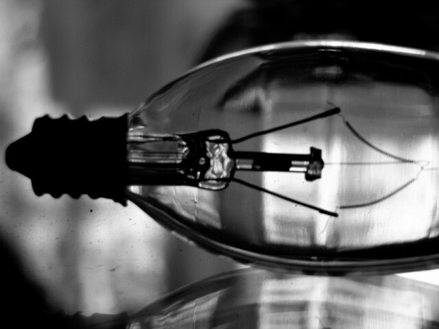
Composition - Good subject, I'm not so sure its good for this particular challenge, but for the purposes of discussion we'll say it is. Firstly, I don't like the mirror underneath. I think over white or grey would've been more effective. There's too much background shadows and stuff. The simplicity of the bulb should've really taken to the forefront and that cannot be effective in such a cluttered environment. The photo has some noise stuff happening in the left bottom corner that I see and have no idea what it could even be. But I think whatever it is, it should be somewhere besides posing for a photo. The black and white choice was a good one though. If it were me, I would've tried to frame this so the bulb was pretty much taking up the whole pic and shot it so it went corner to corner. I would've included the whole bulb as well. This strangely reminds me of an old x-ray film or something.
Technical - Focus is a huge issue with this pic. I could seeing being okay a little soft, but better sharper. I think the focus is what reminds me of old x-ray films. I think the lighting and the exposure of this pic are what really make it unique and really work for the pic well. Maybe a tripod would've helped as the shutter speed is fairly slow. As previously mentioned, I like the black and white.
Overall - The lack of focus and framing really hurt this picture. The background being too busy is also a contributing factor. This subject could make a good image, but it needs some refining and maybe some replanning. Good luck in future challenges - Inspzil |
|
Comments Made During the Challenge  |
|
|
02/09/2003 03:15:43 PM |
| I like the black and white contrast in this photo. It has very nice contrast. |
|
|
|
02/09/2003 07:55:19 AM |
| Sorry but I don't really get it, does it fit the challenge? Black & white suits the image but I can't see any part that's in focus. |
|
|
|
02/07/2003 08:22:56 AM |
| I'm wondering why landscape instead of portrait. Upright with all of the bulb would have been more fitting, I would think. Is that a reflection? It is not clear enough, therefore is distracting. The background being a solid color would have shown off the bulb so much better, in my opinon. That way there would have been nothing else to fight for your attention. Not sure this color tone worked to your advantage. Not sure what would have been better, though. I really do like your concept very much and think it could be a very interesting photo. Just needs better execution. Keep at it. |
|
|
|
02/06/2003 07:38:17 PM |
| I like al of the differneces in the blacks and whites. I also like the light comming in from the black. nice Work |
|
|
|
02/06/2003 03:48:19 PM |
| Very nice. I actually like the fact that it's not crisp. |
|
|
|
02/03/2003 03:07:46 PM |
| Sorry .. this seem to be out of focus |
|
Home -
Challenges -
Community -
League -
Photos -
Cameras -
Lenses -
Learn -
Help -
Terms of Use -
Privacy -
Top ^
DPChallenge, and website content and design, Copyright © 2001-2026 Challenging Technologies, LLC.
All digital photo copyrights belong to the photographers and may not be used without permission.
Current Server Time: 02/01/2026 10:28:18 AM EST.