| Author | Thread |
|
|
01/07/2005 02:57:15 PM |
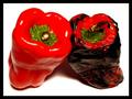
| Opposites do attract... Fun shot. |
|
|
|
02/16/2003 04:24:13 PM |
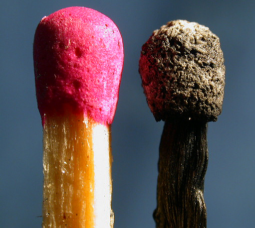
CCHi there Fibre Optix
Fits The Challenge-Yes.
Composition-Nice, good macro.
Background-Fine.
Digital Processing-Good.
My Opinion-I like this shot but feel that the lighting is too strong. Washing out the red top and front of one match. Other then that this did well and works because it's clever, in your face and a good macro. Nice work, as always keep clickin'. |
|
|
|
02/10/2003 08:13:25 AM |
| great minds think alike ; ) |
|
Comments Made During the Challenge  |
|
|
02/09/2003 09:03:00 PM |
|
|
|
02/09/2003 09:16:21 AM |
| I like this a lot! Simple subject, simple lighting, simple background and it worksfor me! very pleasing picture. |
|
|
|
02/09/2003 03:50:38 AM |
| WOW what a macro shot. Excellent before and after photo. I love it. GL. |
|
|
|
02/08/2003 12:36:51 PM |
| The lighting on this is a bit too hard, and the background is a dull colour. It sucks when there are more than one photo of the same thing in a challenge, because we shouldn't score one photo relative to another, but I think "King Flame's Court" shows really well how differently you could have shot this! |
|
|
|
02/08/2003 04:07:39 AM |
| Nice focus, nice contrast. I think this is one of teh best pics of this week! |
|
|
|
02/07/2003 03:29:26 PM |
| challenge met. good title :) i like how you filled the frame with the subjects, and how there are so many textures to see both in the new and the burnt match. those would work even better if your photo was really really sharp and focused throughout. as it is, there are some softer areas that distract a little. the only other thing is the harsh light from the right blowing out the side of the match. otherwise a good entry :) |
|
|
|
02/05/2003 07:07:43 PM |
| I really like the detail and contrast in colors that make this interesting to look at. |
|
|
|
02/05/2003 04:28:59 PM |
| This is an awesome macor. Love the different textures. Good luck. |
|
|
|
02/04/2003 08:04:29 PM |
Well exposed to reveal texture. I'd like to the the composition a little less balanced...perhaps on a diagonal.
Color is good. I can almost smell the sulphur. |
|
|
|
02/04/2003 11:46:11 AM |
| Very nice! Maybe I would have like a little more if the 2 matches would not have been on the same level...Good job! |
|
|
|
02/04/2003 10:14:00 AM |
| Great macro shot, good luck in the challenge. |
|
|
|
02/03/2003 09:42:59 PM |
| GREAT macro shot... the light is a little heavy coming off the unlit match, but this is an awesome photo... I don't think I've ever looked that closely at the detail in matches. Very nicely done. |
|
|
|
02/03/2003 09:03:08 PM |
| Now that's a very interesting close-up. Good job. Jacko. 8. I can't believe I'm saying this, but I think this shot could benefit from adding a border. |
|
|
|
02/03/2003 01:46:10 PM |
| Plain and simple and fantastic. This can't be beat. Great choice of background. Compliments well. Great focus, light, crop, etc. Just a really good photo. |
|
|
|
02/03/2003 01:09:11 PM |
| Lighting is harsh here, but the idea and composition, and macro....very good!! |
|
|
|
02/03/2003 07:28:46 AM |
| Incredble bacro, but it seems as if your lens has a few shortcomings, or that you have attempted to enlarge it a little too much, or that you have saved it with too hig compression. Especially around the edge of the unused match-head, there seems to be a lot of banding and JPG artifacts. Also, the side of the match is a bit over exposed. Despite of this, I am giving this picture a 9. |
|
 Photographer found comment helpful. Photographer found comment helpful. |
|
|
02/03/2003 04:28:14 AM |
|
|
|
02/03/2003 12:59:04 AM |
|
Home -
Challenges -
Community -
League -
Photos -
Cameras -
Lenses -
Learn -
Help -
Terms of Use -
Privacy -
Top ^
DPChallenge, and website content and design, Copyright © 2001-2026 Challenging Technologies, LLC.
All digital photo copyrights belong to the photographers and may not be used without permission.
Current Server Time: 02/01/2026 12:02:06 PM EST.