| Author | Thread |
Comments Made During the Challenge  |
|
|
11/07/2004 03:35:34 PM |
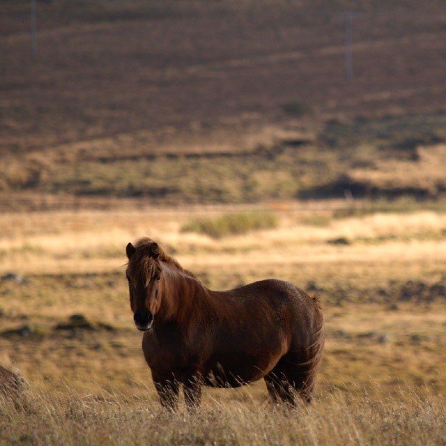
| Feels off-balance to me... A bit top-heavy. I think a bit of fill flash from the phtog's right side would help to bring out more detail in the subject's coat. |
|
 Photographer found comment helpful. Photographer found comment helpful. |
|
|
11/07/2004 12:52:23 PM |
| Love the colors of this. Nicely blurred background. |
|
|
|
11/06/2004 07:33:14 PM |
beautiful image of a horse but the background would look better if it was cropped
half way the background is just taking away from the fabulous horse |
|
|
|
11/06/2004 05:10:49 PM |
| Awesome light, but cloning out the poles in the background would've helped. I'm not sure about the crop, either. Great capture overall. |
|
| Photographer found comment helpful. |
|
|
11/06/2004 10:59:39 AM |
| It looks like telegraph poles in the background that are very distracting, maybe clone them out. Otherwise its a lovely photo. |
|
| Photographer found comment helpful. |
|
|
11/06/2004 05:52:49 AM |
And why does this look Icelandic?
Good shot, 7 |
|
|
|
11/05/2004 08:41:56 AM |
very pretty i think i would like it better with a little off the top
|
|
|
|
11/04/2004 09:38:17 AM |
| Beautifull horse, Maybe could have done with a little tighter crop so we could see the horses face better and maybe some more depth of field. There's something in the background (grey pole, like a pole for power lines) could have cloned it out, but its not realy distracting because of the shallow dof. |
|
| Photographer found comment helpful. |
|
|
11/03/2004 05:54:46 PM |
| Reminds me of the artist Nancy Glazier's work with Paint horses. Nicely done. |
|
| Photographer found comment helpful. |
|
|
11/03/2004 01:37:50 PM |
| Excellent.................... |
|
|
|
11/02/2004 03:35:09 PM |
| The soft focus of the background and the colors successfully enhance the beauty of this lovely horse. |
|
| Photographer found comment helpful. |
|
|
11/01/2004 08:25:01 PM |
| Great shot. I love the tone and feel here. Personally, I feel there's too much negative space, and capping that off, there seems to be some fench colored poles back there that are distracting. You might consider later cropping just below the bottom of the one on the right. |
|
| Photographer found comment helpful. |
Home -
Challenges -
Community -
League -
Photos -
Cameras -
Lenses -
Learn -
Help -
Terms of Use -
Privacy -
Top ^
DPChallenge, and website content and design, Copyright © 2001-2025 Challenging Technologies, LLC.
All digital photo copyrights belong to the photographers and may not be used without permission.
Current Server Time: 04/07/2025 01:12:43 PM EDT.