| Author | Thread |
|
|
02/05/2003 04:36:34 PM |
~~~~Critique Club Comment~~~~
Composition (content)
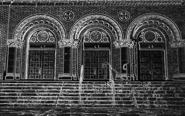
Interesting conversion, combined with the subject it looks like Gothic art. What most struck me in this image was the strange shadow of the handrails, intensified by the glowing edges. It looked strange, out of place.
I really like the effect of what you did and the early morning exposure has made sure that all the details on the arches are clear and not covered in a deep shadow.
I have a small list of suggestion though:
* Level the horizon
* Try to seek a more balanced crop between left and right. The left pillar has space at the left, while the right pillar has been cut trough. A level horizon could also produce a cleaner cut on top, so that the curly decorated stones provide a better top framing (or leave them out).
* Try to spot edit the shadows of the handrails away (it was allowed for this challenge). On the stairs it isn't a problem, but on the door and pillar I think it to be a bit distracting
Including some of the street in front was a good thing.
Camera Work (Technical)
Exposure seems to be good, can't say anything about the other camera stuff. :)
Digital Processing (technical)
See composition.
Was this the max jpeg quality for a monochrome image? I know that sometimes you can get 100%jpeg for monochromes, but with all that detail it makes me wonder. Your picture is only 100kb out of the allowed 150kb you see. Saving it at the highest quality possible within the 150kb filesize limit ensures more edge and detail sharpness and for color images it keeps the colors more consistent.
My opinion
Cool effects, but needs some improvement. |
|
Comments Made During the Challenge  |
|
|
02/02/2003 08:22:18 PM |
| What amazing architecture. Love the black and white. A little dark on the right side on my monitor, but otherwise love it. |
|
 Photographer found comment helpful. Photographer found comment helpful. |
|
|
02/02/2003 05:27:06 PM |
| Looks very strange in black and white. The repairs to the steps jump out at you and give a strange appearance to the building. Would have been better in color, in my opinion. It almost looks like a drawing with some over-emphasis being made. |
|
| Photographer found comment helpful. |
|
|
02/02/2003 04:53:03 PM |
|
|
|
02/02/2003 12:16:37 PM |
| Cool..... Did you use an edge detection filter? It brings out all the amazing brick and stonework nicely, but makes the photo a little too busy in other places. The composition is strong enough to pull it all together, but I'm not sure that I like the image as a whole. |
|
| Photographer found comment helpful. |
|
|
01/30/2003 12:28:20 PM |
| Interesting effect. I think it needs to be cropped closer on the left to make it symmetrical, though. |
|
| Photographer found comment helpful. |
|
|
01/28/2003 12:23:48 PM |
| i do like the symmettry on this. i dont like that the pic seems a hair tilted to the right and that right edge is cut off unequally. and that the right edge is dark. I'm not sure how much the filter does for this pic. I think I might have rather seen it leveled and either in color or toned using the channel mixer. |
|
| Photographer found comment helpful. |
|
|
01/27/2003 09:10:08 PM |
| i like the idea but it looks a little overdone. |
|
|
|
01/27/2003 12:49:42 PM |
| I love the the beautifull shapes here. However, the treatment applied (nagative image) makes it look a bit dirty. Good luck. |
|
| Photographer found comment helpful. |
|
|
01/27/2003 03:12:34 AM |
| funny shadows, I like this one |
|
Home -
Challenges -
Community -
League -
Photos -
Cameras -
Lenses -
Learn -
Help -
Terms of Use -
Privacy -
Top ^
DPChallenge, and website content and design, Copyright © 2001-2026 Challenging Technologies, LLC.
All digital photo copyrights belong to the photographers and may not be used without permission.
Current Server Time: 02/01/2026 10:30:29 AM EST.