| Author | Thread |
|
|
02/21/2015 08:38:57 PM |
| powerful, even oppressive. brave choices. |
|
 Photographer found comment helpful. Photographer found comment helpful. |
Comments Made During the Challenge  |
|
|
02/21/2015 08:13:12 AM |
| blues and gold are always a good choice:) |
|
| Photographer found comment helpful. |
|
|
02/21/2015 07:41:29 AM |
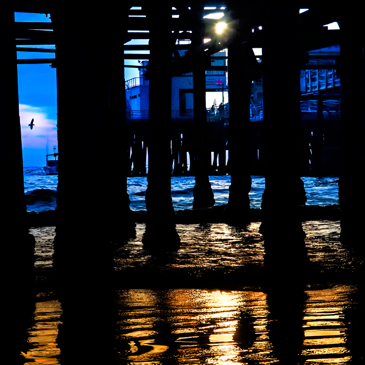
| Strong design elements artistically combined: color contrast between gold tones and blue combine with strong dark shapes of pier supports and dark horizontals of water ripples. Could consider cropping away the upper part of the distant pier where the white light and paler cyan tones dilute the impact of the main part of the image. |
|
| Photographer found comment helpful. |
|
|
02/20/2015 04:53:50 PM |
| Nice complementary colors. |
|
| Photographer found comment helpful. |
|
|
02/20/2015 02:40:06 PM |
| You've got lucky with that bird! :-) |
|
| Photographer found comment helpful. |
|
|
02/18/2015 09:18:22 AM |
| I love the different color tones. |
|
| Photographer found comment helpful. |
|
|
02/17/2015 05:29:33 AM |
| The bird detail, the cross, and the solar flare are nice details. The golden tide is excellent as well, and where this falls short, is the inclusion of purple. the blue and purple combination doesn't work so well. |
|
| Photographer found comment helpful. |
Home -
Challenges -
Community -
League -
Photos -
Cameras -
Lenses -
Learn -
Help -
Terms of Use -
Privacy -
Top ^
DPChallenge, and website content and design, Copyright © 2001-2025 Challenging Technologies, LLC.
All digital photo copyrights belong to the photographers and may not be used without permission.
Current Server Time: 04/09/2025 03:02:40 AM EDT.