| Author | Thread |
Comments Made During the Challenge  |
|
|
10/26/2004 07:08:11 AM |
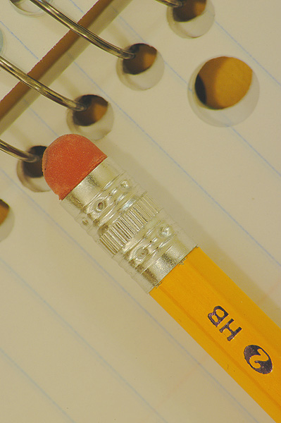
| The sharpness needs work. Perhaps better lighting would help too... |
|
|
|
10/26/2004 02:56:25 AM |
| This is the sort of picture I would have chosen when looking for photos to head artricles for publication BUT the pencil would have been too central. I have moved the pencil up in Photoshop and left more space in the bottom left. It would then have great commercial prospects and I think unbalances the picture so it gives it more "PUNCH" |
|
|
|
10/23/2004 05:41:21 AM |
What a pleasing rendition of these familiar objects. I think this image is a great example of the suggestion to get close to one's subject, no get closer. Just enough here to convey the idea. Nice!
Lighting is expertly handled. Focus is spot on. Composition has a pleasant geometry. |
|
|
|
10/23/2004 02:00:26 AM |
| The diagonal composition took my eye, its a strong image but to me says nothing about school perhaps a text book would have been a better idea to tie it together rather than the pad. 4 |
|
|
|
10/20/2004 02:34:28 PM |
| the geometries seem to conflict - perhaps the pencil laid from lower left to upper right |
|
|
|
10/19/2004 09:32:45 PM |
| good shot nice comp. and gr8 name for it. |
|
|
|
10/19/2004 08:27:52 PM |
| Nice sharp focus. Good job. |
|
Home -
Challenges -
Community -
League -
Photos -
Cameras -
Lenses -
Learn -
Help -
Terms of Use -
Privacy -
Top ^
DPChallenge, and website content and design, Copyright © 2001-2025 Challenging Technologies, LLC.
All digital photo copyrights belong to the photographers and may not be used without permission.
Current Server Time: 04/07/2025 02:02:26 PM EDT.