| Author | Thread |
|
|
03/18/2005 08:56:29 PM |
| Lesya , I am so loving this !!! It is almost like my ribbon winnner...just a little darker...awesome photo. |
|
 Photographer found comment helpful. Photographer found comment helpful. |
|
|
01/05/2005 05:12:18 PM |
very nice shot i will try to go to the park there to get some similar shots...i did some but not as imprisive as this one..if u have time u can see my old shots at this link
//www.photo.net/photodb/member-photos?user_id=1185903&include=all |
|
| Photographer found comment helpful. |
|
|
10/24/2004 08:14:35 PM |
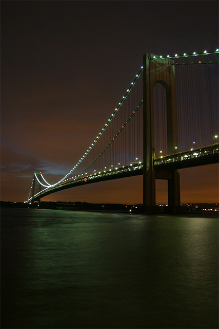
Thanks everyone for comments, all of it is right. And yes, water looks a little bit tilted,but I had no choice in this case. It was a choice between tilting bridge or water and horizon. And, of course, I picked up water. Regarding colors - all colors absolutely natural, We had storm coming up that night,so colors different because of the wind and little rain.
Again, thanks everyone for commenting! |
|
Comments Made During the Challenge  |
|
|
10/23/2004 07:35:51 PM |
| A lovely placid exposure...I admittedly tend to have a bias toward tighter crops and in this shot I would only wish that the last left inch were cropped off to give the bridgework a bolder spanning feel/look..leaving it in there weakens the overall impact for myself....but ther than that what a great shot! :) |
|
| Photographer found comment helpful. |
|
|
10/23/2004 02:32:16 PM |
returning for comments
A very cool image but water has lost its fluidity and the eyes tries hard to find the natural equilibrium. Yet, the image's colors are great. |
|
| Photographer found comment helpful. |
|
|
10/21/2004 08:34:48 PM |
| Really nice exposure and angle of view |
|
| Photographer found comment helpful. |
|
|
10/20/2004 09:17:18 PM |
| Oh no. You used the word sunset. I hope you are not getting bashed too drastically for that. The composition is a bit off because the water looks tilted and the treeline looks tilted in the other direction. Not real sure what is going on there? Also, the water seems a bit too green in relation to the color of the sky. Other than those distractions, pretty nice. |
|
| Photographer found comment helpful. |
|
|
10/20/2004 09:06:04 PM |
| Probably purposeful, but I think the tilted horizon detracts from an otherwise great shot |
|
| Photographer found comment helpful. |
|
|
10/19/2004 06:59:35 AM |
|
| Photographer found comment helpful. |
|
|
10/18/2004 11:25:21 PM |
| Excellent! the perspective and DOF are wonderful. |
|
| Photographer found comment helpful. |
|
|
10/18/2004 11:24:13 PM |
| Nice compozition...and I like color of sky. |
|
| Photographer found comment helpful. |
|
|
10/18/2004 05:59:04 PM |
|
| Photographer found comment helpful. |
|
|
10/18/2004 07:53:46 AM |
Title: 3 -- Spelled Wrong... VERRAZANO with 2 "R"s
Exposure: 7 -- Looks like a true representation of lighting conditions
Composition: 4 -- Horizon slanted. And the crop should have been tighter. Too much space.
Focus: 4 -- Seems a little soft.
Overall score: 4 |
|
| Photographer found comment helpful. |
Home -
Challenges -
Community -
League -
Photos -
Cameras -
Lenses -
Learn -
Help -
Terms of Use -
Privacy -
Top ^
DPChallenge, and website content and design, Copyright © 2001-2025 Challenging Technologies, LLC.
All digital photo copyrights belong to the photographers and may not be used without permission.
Current Server Time: 04/06/2025 10:47:21 PM EDT.