| Author | Thread |
|
|
12/02/2014 10:12:48 PM |
|
Comments Made During the Challenge  |
|
|
12/02/2014 03:54:03 PM |
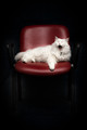
| Very nice perspective and symmetry. Not super crazy about the very bright left side and the much darker right side, but it might have been tough to add a fill light and get it all color balanced. I prefer the darker look of the right side, though. |
|
|
|
11/30/2014 08:58:46 AM |
|
|
|
11/29/2014 03:45:15 PM |
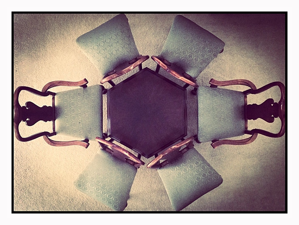
| Very cool graphical set up. I like all the wood textures here. Lighting is perhaps a bit odd (or is that a hard vignette). A bit more space at the edges of the frame would help the composition. Wide white border distracts rather than helps. |
|
|
|
11/26/2014 04:09:16 AM |
| Nice, my top choice for the blue. An 8 from me (9 if the crop includes the chairs completely) |
|
|
|
11/25/2014 08:45:04 PM |
|
Home -
Challenges -
Community -
League -
Photos -
Cameras -
Lenses -
Learn -
Help -
Terms of Use -
Privacy -
Top ^
DPChallenge, and website content and design, Copyright © 2001-2025 Challenging Technologies, LLC.
All digital photo copyrights belong to the photographers and may not be used without permission.
Current Server Time: 04/06/2025 11:10:31 PM EDT.