| Author | Thread |
|
|
10/05/2014 03:50:50 PM |
Greetings from the Critique Club!
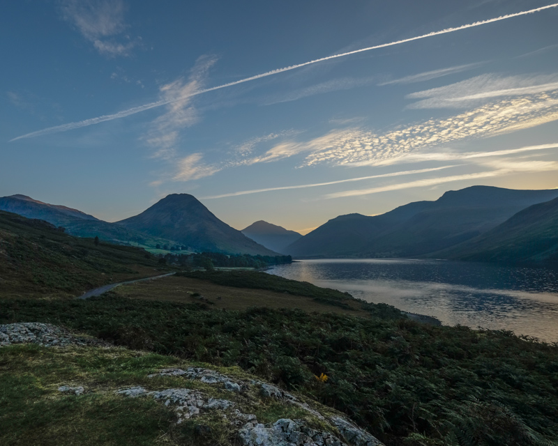
I like the low lighting and leading lines of comp here, though I think it's also a little on the safe side - the horizon looks a little too centered. Though I see the triangles and geometry, like the obvious ones in the mountains, but also the road/field junction, this image simply isn't as literal as voters like.
The contrails, especially the topmost one in the sky, detract from the triangular shape of the mountains, and of course white will always draw the eye like a magnet.
Hope this critique has been of help, feel free to PM me.
Susan |
|
 Photographer found comment helpful. Photographer found comment helpful. |
Comments Made During the Challenge  |
|
|
10/02/2014 03:14:09 PM |
|
| Photographer found comment helpful. |
|
|
09/29/2014 09:11:27 AM |
| The scene is full of angles and geometry for sure. |
|
| Photographer found comment helpful. |
Home -
Challenges -
Community -
League -
Photos -
Cameras -
Lenses -
Learn -
Help -
Terms of Use -
Privacy -
Top ^
DPChallenge, and website content and design, Copyright © 2001-2025 Challenging Technologies, LLC.
All digital photo copyrights belong to the photographers and may not be used without permission.
Current Server Time: 04/06/2025 11:09:01 PM EDT.