Critique Club Comment:
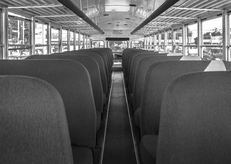
A very familiar site to many of us, and a sure sign of back to school. A nice image, for sure, but not anything that really grabbed my attention after I got past the familiarity. Given the lack of a specific subject all I am left with is the overall symmetry within the shot, which would be fine if you nailed it.
Alas, there are two main issues with that symmetry. First, the centerline of the symmetry is off center - the center of the aisle runs to the right of center. But that's not all that's wrong, the plane of reference is rotated slightly right as well. So while the crop looks like you left too much to the left, if you look along the windows you have more of the right side showing - sure evidence of the need for horizontal perspective correction. This image greatly benefits from first correcting the horizontal perspective, pulling the right side towards the front slightly, and then cropping so that the center line runs directly down the center.
You still have some issues after that in that the bus is empty and there is a lot to distract you outside the windows. You need something to command the viewer's attention. Maybe boost the contrast between the seats and the aisle to pull the eye through the photo down the center to the back of the bus? Darken the seat covers while lightening the center strip, allowing the metal ridges that border it to focus the attention through the frame. While I am not particularly a fan of selective color, perhaps you could have played off the black and white dreariness of the inside of the bus taking you to school with a full-color view outside the windows, highlighting the freedom you're now losing for most of your day?
Again, not a bad photo, outside of the symmetry issues. But not one that holds the attention. |