| Author | Thread |
|
|
01/31/2003 12:50:26 AM |
Greetings from the Critique Club.
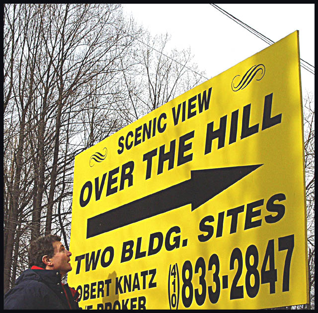
First off I'd like to say if this was taken on the side of the road, it is a road sign. So whoever voted you down for that was wrong in my opinion.
This photo has potential to be much better. The sky seems a little overexposed. Try getting closer to the sign and eliminate the sky above it along with the telephone and powerlines.
I don't understand why you put the man in the picture. He doesn't look over the hill to me and doesn't add much to the photo. I would just not have put him.
I like the bright yellow on this. Again this photo had more potential to be better in my opinion. Good luck in future challenges. |
|
Comments Made During the Challenge  |
|
|
01/26/2003 02:31:57 AM |
| IMO looks slightly over exposed. |
|
|
|
01/24/2003 08:12:40 PM |
|
|
|
01/23/2003 07:38:14 PM |
| a little off the topic for me |
|
|
|
01/23/2003 05:45:30 PM |
| One of the best things I learned while going to college (the first time) was that at least once you're over the hill you get to coast all the way down... |
|
|
|
01/23/2003 04:30:24 PM |
| this is an advertisement sign rather than a "road sign": A lot have done this this week and it's a shame. This is a really good and clear photo. But it doesn't meet the challenge in my opinion and that's what this is all about. I hate to cut the score but to be fair to those who took "road signs" must. |
|
|
|
01/23/2003 10:21:00 AM |
| I'm there! Very good shot. The person being in the shot looking at the sign is a great add. I'm not sure I like the framing. (Sign going off the frame...) Still, it's well done and very good color, so it's an 8. Swash |
|
|
|
01/23/2003 04:00:54 AM |
| the focus could be better. good idea, and good color. |
|
|
|
01/21/2003 04:53:28 PM |
| funny, like the angle, might have cropped out the power lines if it was mine, though |
|
|
|
01/20/2003 05:50:22 PM |
| I like the photo, but it's slightly distracting that the bottom edge of the sign is cropped out. In fact, I think you could have probably included at least half of the mand and really brought him into the photo. His facial expression is quite good, as are exposure, colour and focus. |
|
|
|
01/20/2003 02:53:20 PM |
| Pretty funny... Should have had an old man looking at the sign instead. But you get a rare 7 since your pic actually has something to do with the challenge. :) |
|
|
|
01/20/2003 05:28:00 AM |
| Don't like the person looking at the sign - the sign is good, but I don't like the person. |
|
|
|
01/19/2003 07:45:01 PM |
| Nice big road sign!! It seems just a bit soft on focus. |
|
Home -
Challenges -
Community -
League -
Photos -
Cameras -
Lenses -
Learn -
Help -
Terms of Use -
Privacy -
Top ^
DPChallenge, and website content and design, Copyright © 2001-2025 Challenging Technologies, LLC.
All digital photo copyrights belong to the photographers and may not be used without permission.
Current Server Time: 04/06/2025 10:41:44 PM EDT.