| Author | Thread |
|
|
08/26/2014 04:17:29 AM |
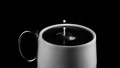
Critique Club Review:
Color Saturation and Hue: not sure color wouldn't have been a better choice
Brightness and contrast: image is mostly well lit, the eye are a bit bright compare to the rest of the image
Focus and depth of field: clean and sharp
nice clean sharp image, not much to critique negatively, its well done. |
|
 Photographer found comment helpful. Photographer found comment helpful. |
Comments Made During the Challenge  |
|
|
07/29/2014 12:00:09 PM |
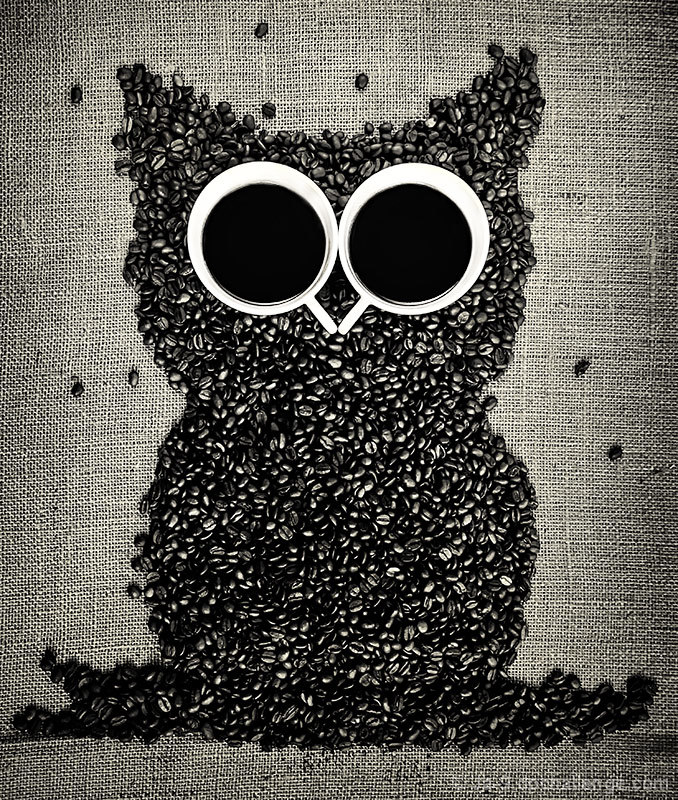
| Silly and fun. I also like the background. Good contrast, too. |
|
| Photographer found comment helpful. |
|
|
07/29/2014 07:48:19 AM |
| Creative idea. I like your choice of backdrop. |
|
| Photographer found comment helpful. |
|
|
07/29/2014 07:36:05 AM |
| Ha! Just commented on this guy's brother :) |
|
| Photographer found comment helpful. |
|
|
07/28/2014 04:43:52 PM |
|
| Photographer found comment helpful. |
|
|
07/23/2014 09:43:32 AM |
|
| Photographer found comment helpful. |
|
|
07/22/2014 11:02:48 PM |
| Did you try this in colour? The rich colour of coffee is so wonderful it almost seems a shame to B&W it out. I love the idea here. :) |
|
| Photographer found comment helpful. |
|
|
07/22/2014 08:58:37 PM |
|
| Photographer found comment helpful. |
Home -
Challenges -
Community -
League -
Photos -
Cameras -
Lenses -
Learn -
Help -
Terms of Use -
Privacy -
Top ^
DPChallenge, and website content and design, Copyright © 2001-2025 Challenging Technologies, LLC.
All digital photo copyrights belong to the photographers and may not be used without permission.
Current Server Time: 04/07/2025 02:28:18 AM EDT.