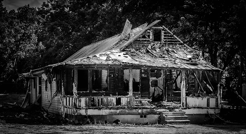
IMG_7216-4
Converted from RAW, LRcc, black and white, contrast, hightlights, shadows, curve, detail, noise, radial filter, PScc, curve, highlight, image size, saved for web
Statistics
Place: 20 out of 99 Avg (all users): 6.0115 Avg (commenters): 6.3333 Avg (participants): 6.0000 Avg (non-participants): 6.0213 Views since voting: 297 Views during voting: 169 Votes: 87 Comments: 4 Favorites: 0
Well, this is interesting since I've drawn this to critique and already left a comment during the voting, so I'll expound on that.
Composition is OK. I find it interesting that you compressed the crop top-to-bottom. I mentioned the vignetting feels tight and perhaps more room above and/or below would have eased that. Original lighting looks to have been rather harsh, and your high contrast treatment doesn't necessarily help with that.
There's a lot of debris across the roof and on the porch, but there's also a lot along the side of the house hidden in the shadows. Softening the contrast might have helped you show a bit of that as well. As I mentioned, there's also an overtly bright spot on the roof (bare alluminium?) that draws the eye immediately - but there's nothing there. All this goes to say that there's no real subject here for the eye to be drawn to. I suspect you mean it to be the house, and if so, show the whole thing. Pull the shadows out on the side, burn in the roof a bit and get some evenness to the light. Then burn in the area in front of the house and the highlights in the trees and make the whole thing pop.
All that said, there's still a lot going on with the place and to show it in a way that makes you feel it and see it will take some work, particularly in a B&W conversion. Greyscale can make a lot of elements of different colors blend together, so you need to be careful with this and use a tool that allows you to adjust the sensitivity of your various colors in the greyscale image to get the definition you need.
Spending the time with this image you could have, as I said before, earned a lot better than the 5 I gave you initially, and the 6 that you averaged.
Vignette feels too tight - side feels like it should be a little brighter and I'm getting a huge hot spot in the middle that is distracting as heck. Properly trated this could have been a lot higher than 5.