| Author | Thread |
Comments Made During the Challenge  |
|
|
10/14/2004 02:57:13 PM |
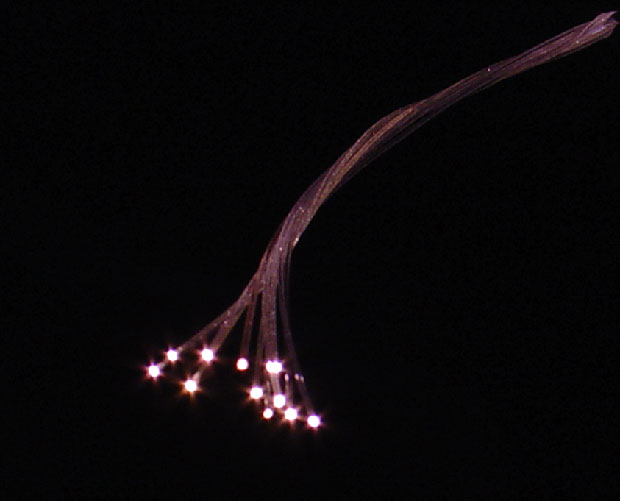
| I love this, It's really a cool photo |
|
 Photographer found comment helpful. Photographer found comment helpful. |
|
|
10/13/2004 11:40:50 PM |
| It's like you didn't have enough light, or maybe it looks like that on purpose. I would've prefer more composition elements. Too much for minimalistic picture, not enough for composition. 4. |
|
| Photographer found comment helpful. |
|
|
10/13/2004 03:22:48 PM |
| I wish it was just a little more in focus... |
|
| Photographer found comment helpful. |
|
|
10/13/2004 05:13:01 AM |
| Not in focus. Needs to be. |
|
| Photographer found comment helpful. |
|
|
10/13/2004 04:34:55 AM |
| It´s a good idea but there are several things that you could do better. First the flare is a drawback, try taking from a different angle to reduce it. Second it´s a bit underexposed and also you have too much empty space for such a simple backround. Keep in mind though that this is only my humble opinion. |
|
| Photographer found comment helpful. |
Home -
Challenges -
Community -
League -
Photos -
Cameras -
Lenses -
Learn -
Help -
Terms of Use -
Privacy -
Top ^
DPChallenge, and website content and design, Copyright © 2001-2025 Challenging Technologies, LLC.
All digital photo copyrights belong to the photographers and may not be used without permission.
Current Server Time: 04/07/2025 01:23:17 AM EDT.