| Author | Thread |
|
|
01/27/2003 01:15:53 AM |
| maybe because i don't have any kids, i didn't get it . . . |
|
Comments Made During the Challenge  |
|
|
01/26/2003 08:48:31 PM |
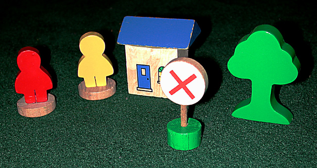
| Simple and effective. I do not like the colouring of the roof of the fake house though. Still. Effective. jgillard7 |
|
 Photographer found comment helpful. Photographer found comment helpful. |
|
|
01/26/2003 12:06:13 PM |
| toy road signs does nothing for me |
|
|
|
01/24/2003 06:21:19 PM |
|
|
|
01/23/2003 05:20:10 PM |
|
|
|
01/23/2003 07:21:32 AM |
| It's a nice alternative take on the subject. I think I would have got a lower viewpoint, so that you aren't looking down on the objects. Maybe include a toy car? |
|
| Photographer found comment helpful. |
|
|
01/22/2003 10:20:49 PM |
| cute, interesting take on the challenge |
|
|
|
01/21/2003 07:07:27 PM |
| Good focus and color. The flash shadows are a tad harsh. It's cute. Whatever you used for background (floor) works with this set up. You might want to try moving back a bit or reducing the power of your flash (if feature possible). It's just a little to strong. 6 Swash |
|
| Photographer found comment helpful. |
|
|
01/21/2003 07:51:49 AM |
| I had thought about doing something very similar. Great minds I guess you could say. |
|
|
|
01/20/2003 09:40:33 PM |
| Composition is very good and colour is vibrant. The lighting looks a little bit harsh though - was it done with a flash perhaps? |
|
| Photographer found comment helpful. |
|
|
01/20/2003 03:07:10 PM |
|
|
|
01/20/2003 02:20:37 PM |
| sorry - i didn't find this a compelling photo. the title helps make it work (although the title might work better with a photo taken of a real sign from a low POV), and i'm having problems saying why i don't like it - the quality is fine, there is a sign in the picture, and on an originality scale it is okay. maybe its because signs tend to be part of outdoor environments and you expect space and scale, and this portrays the opposite of that. also your sign is just sitting there - there is not context/purpose to it in your composition. |
|
| Photographer found comment helpful. |
|
|
01/20/2003 10:14:59 AM |
| A little too washed out, but a great idea. |
|
| Photographer found comment helpful. |
|
|
01/20/2003 07:58:00 AM |
| I would have liked this photo better if it had not been taken from above, but rather at the same level of the toys. |
|
| Photographer found comment helpful. |
|
|
01/20/2003 01:08:30 AM |
| The flash is harsh, and the subject isn't very forgiving. |
|
| Photographer found comment helpful. |
Home -
Challenges -
Community -
League -
Photos -
Cameras -
Lenses -
Learn -
Help -
Terms of Use -
Privacy -
Top ^
DPChallenge, and website content and design, Copyright © 2001-2026 Challenging Technologies, LLC.
All digital photo copyrights belong to the photographers and may not be used without permission.
Current Server Time: 02/01/2026 11:46:22 AM EST.