| Author | Thread |
|
|
01/30/2003 04:40:34 PM |
Critique Club Critique
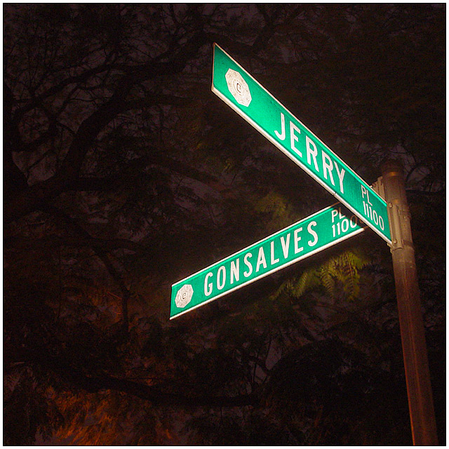
(1) COMPOSITION (CONTENT) � I like the composition of this shot. The eye is drawn to the upper right to the sign. Good balance of color between main subject and background.
(2) BACKGROUND � The background you chose works well, an effective use of negative space.
(3) CAMERA WORK ,TECHNICAL � Focus on the sign is very good. I think your choice of aperture gave you too large a DOF. I think the photo is greatly improved with the tree limbs more out of focus. However, I realize the tradeoff you have in time. Using a f/2.8 for instance for good DOF would have only given you a sec or so for the lighting. Probably too short. Was it really dark when you shot this? Any background light hurts you here. The other �distraction� is the lighting of the leaves just beyond the Gonsalves sign. This was probably hard to avoid, but if you did, the photo looks much better.
(4) DIGITAL PROCESSING ,TECHNICAL � Looks good, no suggestions. It would be interesting to see this in b&w.
(5) MY OPINION ON THE PHOTO � A really nice shot, probably deserves a slightly higher score. I would think that more practice with light painting, and a better choice of sign without the close in leaves, will give you a much better shot next time.
Jim msp
|
|
 Photographer found comment helpful. Photographer found comment helpful. |
Comments Made During the Challenge  |
|
|
01/24/2003 05:37:38 AM |
| this is a unique shot in this challenge, the flash almost created a halo of light around the sign. good job |
|
| Photographer found comment helpful. |
|
|
01/24/2003 12:48:18 AM |
| The background should've been lit, or totally black. The little bit of stuff behind the signs is distracting. - Inspzil |
|
| Photographer found comment helpful. |
|
|
01/23/2003 05:44:12 PM |
|
|
|
01/23/2003 10:43:50 AM |
| Interesting, but not really that appealing. |
|
| Photographer found comment helpful. |
|
|
01/22/2003 05:42:57 PM |
| I like the angle and the tree in the background is neat-o |
|
| Photographer found comment helpful. |
|
|
01/22/2003 03:28:49 PM |
| I like your use of flash...very dramatic and the background of trees compliments the street sign very well. |
|
| Photographer found comment helpful. |
|
|
01/21/2003 06:45:46 PM |
| The lighting on the tree is interesting. Did you use a flashlight perhaps to light the sign? Great clarity on the sign. I'm not sure from your title whether "Jerry and Gonsalves" is something I should recognise, or just a corner you chose randomly (perhaps where you live). |
|
| Photographer found comment helpful. |
|
|
01/20/2003 11:55:05 PM |
good composition, the background on the left looks like a painting. Good job! 8 from me.
|
|
| Photographer found comment helpful. |
|
|
01/20/2003 03:15:02 PM |
| And the answer is.... ? What does this mean? |
|
Home -
Challenges -
Community -
League -
Photos -
Cameras -
Lenses -
Learn -
Help -
Terms of Use -
Privacy -
Top ^
DPChallenge, and website content and design, Copyright © 2001-2025 Challenging Technologies, LLC.
All digital photo copyrights belong to the photographers and may not be used without permission.
Current Server Time: 04/06/2025 10:41:31 PM EDT.