| Author | Thread |
|
|
01/30/2003 08:43:43 AM |
"Critique Club Comment"
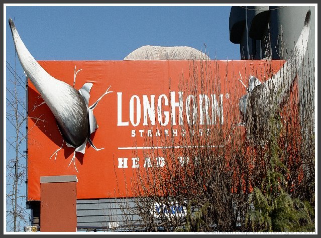
COMPOSITION- Composition is ok in this. I like how you've filled the frame. The colors and sign are both great and interesting. The only thing compositionally that kind of ruins the shot is the big bush in front of the sign. It kind of distracts from the whole right side of the photo.
BACKGROUND- Background is very simple. It doesn't take away from the photo at all.
CAMERA WORK- your shutter speed and aperature are right on. The blue of the sky isn't washed out and your whites are white. There are also no distracting hard shadows. You've done great on this.
DIGITAL PROCESSING- your post processing is done good. The colors are right and you have slight compression, but not anything to screw anything up.
MY OPINION- I love the sign. The horns make it unique. The only thing that takes away for me is the bush. Everything else is great. |
|
 Photographer found comment helpful. Photographer found comment helpful. |
Comments Made During the Challenge  |
|
|
01/26/2003 06:26:16 PM |
| I like it. Different from most. |
|
| Photographer found comment helpful. |
|
|
01/26/2003 04:56:50 PM |
| Too bad most of the sign is covered up! Maybe a different angle would of helped. jgillard6 |
|
| Photographer found comment helpful. |
|
|
01/26/2003 03:17:36 PM |
| the bushes ruin the photo...maybe bring a hedge trimmer next time |
|
| Photographer found comment helpful. |
|
|
01/26/2003 01:10:02 PM |
| those horns really are awfully long. |
|
| Photographer found comment helpful. |
|
|
01/24/2003 05:36:40 AM |
| this is a billboard, which isn't a road sign imo. but besides that there's a freakin bush in the way |
|
|
|
01/23/2003 10:40:36 AM |
| Is this the one where the cow is on top of the building? Nice sharp photo with good details. But is this considered a "road sign"? I've seen a lot of strange things used to try to meet the challenge this week. I'll give you the benefit of the doubt because it is meant to be seen from the road, even though I don't think this was what they meant. It's a nice photo. |
|
| Photographer found comment helpful. |
|
|
01/23/2003 03:27:58 AM |
| Wow that is some sign! The plant on the right distracts a little though. Wasn't it possible to get this shot at a different angle or position? |
|
| Photographer found comment helpful. |
|
|
01/21/2003 09:51:44 PM |
| Unfortunately the bush is in front of the sign and depreciates your photo. |
|
|
|
01/21/2003 02:42:57 PM |
| The shrubs / trees in the foreground are, unfortunately, very distracting. It's virtually impossible to read "Steakhouse". Other than that the exposure and focus look very good. Also, framing of the horns is quite good. |
|
|
|
01/21/2003 12:28:13 PM |
Wow, neat billboard! Very good focus, framing, color. I'm not terribly fond of the brush in the foreground, too much of it. Too bad the side borders were junked up with that building and the overhead wires, but I'm pretty soft on those sorts of issues (no score change due to it). The horn I see is a tad over-exposed.
7 Swash |
|
| Photographer found comment helpful. |
|
|
01/21/2003 12:03:41 AM |
| Somebody needs to do some pruning.... cool sign |
|
| Photographer found comment helpful. |
|
|
01/20/2003 01:10:19 PM |
| Interesting sign but the bushes in front of it ruin the shot. :( Maybe you could have shot it from the far left to avoid that? |
|
|
|
01/20/2003 09:51:29 AM |
|
| Photographer found comment helpful. |
|
|
01/20/2003 06:05:26 AM |
| If only the bush wasn't there this would be great!! Original sign!! |
|
| Photographer found comment helpful. |
|
|
01/20/2003 05:07:57 AM |
|
| Photographer found comment helpful. |
Home -
Challenges -
Community -
League -
Photos -
Cameras -
Lenses -
Learn -
Help -
Terms of Use -
Privacy -
Top ^
DPChallenge, and website content and design, Copyright © 2001-2025 Challenging Technologies, LLC.
All digital photo copyrights belong to the photographers and may not be used without permission.
Current Server Time: 04/09/2025 12:07:22 PM EDT.