| Author | Thread |
|
|
01/31/2003 05:58:57 PM |
Critique Club critique
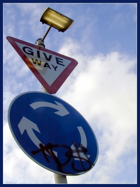
While the perpective certainly makes this photo an interesting one I feel a little uncomfortable with how much the left edge is being crowded. I would like to see the angle of the pole exaggerated even more so that the round sign is positioned on the right side with the top of the post in its same location to create an even more dynamic look and feel to the image. This positioning would also create triangular shapes in the negative space that would compliment the triangular sign. The reflection of the light bothers me a little as well and maybe the use of a polarizer filter could have reduced the reflection. You chose a good background that adds to the dramatic effect. The colors are good and overall the photo is very sharp and clean. The border does a nice job of presenting your photo without overpowering it. All and all you did a nice job with this photo.
Tim Jensen |
|
 Photographer found comment helpful. Photographer found comment helpful. |
|
|
01/28/2003 01:42:41 AM |
| I'm really surprised that this one didn't do better. Ironic really that the grafitti that so many people didn't like was the whole point of the photo!! It was a shame that the reflection of the light was there though. |
|
| Photographer found comment helpful. |
Comments Made During the Challenge  |
|
|
01/26/2003 08:16:23 PM |
| the glare from the light bothers me...so does the grafitti |
|
|
|
01/26/2003 04:25:17 AM |
| Nice viewpoint. The only thing I don't like about this photo is the reflection of the light on the Give Way sign, it's a shame that the light was on. |
|
| Photographer found comment helpful. |
|
|
01/24/2003 01:33:30 PM |
Very good focus and color. Nice framing. Pretty sky. General interest - medium
8 Swash |
|
| Photographer found comment helpful. |
|
|
01/24/2003 09:45:44 AM |
| the signs are too dark, the reflection of the light isn't a plus, the graffiti also takes away. this is a good example of how to use perspective to make your photo stand out against the sky |
|
| Photographer found comment helpful. |
|
|
01/23/2003 03:12:56 AM |
| This is intresting and a good shot to. I understand that Tag is the term for Marked by Graffitti but I think it actually takes away form the shot. |
|
|
|
01/21/2003 11:45:36 PM |
| I would have really liked this without the graffiti. Angle of shot and composition are nice. |
|
|
|
01/20/2003 05:27:46 PM |
| I sure wouldn't know what to do here. I'd give way to everyone I guess and not move until I was the last one left. Love the angle you took it at. That adds at least 2 to 3 more points. Good focus and crop. Real nice job. It's a 8 from me. |
|
| Photographer found comment helpful. |
|
|
01/20/2003 05:18:17 PM |
| interesting angle. a bit dark. wish the graffitti wasn't there. |
|
Home -
Challenges -
Community -
League -
Photos -
Cameras -
Lenses -
Learn -
Help -
Terms of Use -
Privacy -
Top ^
DPChallenge, and website content and design, Copyright © 2001-2026 Challenging Technologies, LLC.
All digital photo copyrights belong to the photographers and may not be used without permission.
Current Server Time: 02/01/2026 11:41:38 AM EST.