| Author | Thread |
|
|
02/01/2003 04:42:48 PM |
Critique Club Review
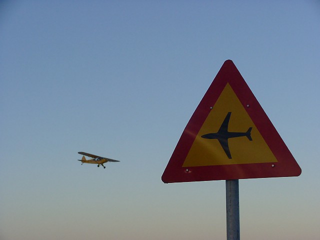
I really like this picture. You did an almost perfect job of lining uo the air plane and the road sign. Just a smidge higher would have been spot on. However, it is obvious that there isn't a whole lot of time to carry it off. The reflection across the sign is a minor distraction, but nothing fatal.
Overall the picture is a little dark. Brightened a bit and then adjusted for contrast and saturation if needed, this picture would look great as a poster. |
|
Comments Made During the Challenge  |
|
|
01/26/2003 04:53:53 PM |
|
|
|
01/26/2003 09:02:54 AM |
| how long did you wait to capture this?! the sign would be more brillant if the sun were lighting it! |
|
 Photographer found comment helpful. Photographer found comment helpful. |
|
|
01/25/2003 05:22:45 AM |
| What a terrific idea! Timing is perfect. This would be more effective if you lightened it up a bit and increased sharpness and contrast. These things are easy adjustments in any photo editing program. With those improvements I would have given this a 9. As it is I must score it lower. 6 |
|
| Photographer found comment helpful. |
|
|
01/24/2003 08:43:02 AM |
Great shot! I like how the two planes are flying at each other. It's too bad camera's can't be set to two focal ranges, it would be asking for the moon and the stars to have the plane in strong focus, too. 8 Swash
(I don't know if the sign was bent, or what, but that streak across the sign....well, I just wish it wasn't there.) |
|
| Photographer found comment helpful. |
|
|
01/23/2003 08:08:35 PM |
| Exposure could've been a little better here. But overall I really like the idea. Nice Job. |
|
| Photographer found comment helpful. |
|
|
01/23/2003 10:36:37 AM |
| Nice capture, now lighten the photo just a little and you got it all. This way it's an 8. |
|
| Photographer found comment helpful. |
|
|
01/23/2003 09:00:15 AM |
|
|
|
01/22/2003 06:04:09 PM |
| Good idea - is this a road sign or not. Don't worry - I definitely consider this on topic. It looks like the sign is bent slightly - that's a shame because as first it looked like a defect in the image (especially the left edge of the sign). Also, the sign is perhaps a little too dark, but it's not too bad |
|
| Photographer found comment helpful. |
|
|
01/22/2003 08:45:51 AM |
|
|
|
01/21/2003 06:26:52 PM |
| Seized the opportunity for a photo |
|
|
|
01/21/2003 11:58:09 AM |
| Nice catch... I maybe would have tried cropping off a little more at the top, and maybe some on the left but that is just personal oppinion. I like the bend in the sign, I think it adds character. Good luck. |
|
| Photographer found comment helpful. |
|
|
01/21/2003 03:19:26 AM |
| I'd just like the sign to be a little brighter. |
|
| Photographer found comment helpful. |
|
|
01/21/2003 02:08:51 AM |
| the sign is a bit too dark |
|
| Photographer found comment helpful. |
|
|
01/20/2003 11:56:56 PM |
|
|
|
01/20/2003 01:19:09 PM |
|
|
|
01/20/2003 10:53:57 AM |
|
|
|
01/20/2003 09:59:32 AM |
| Clever juxtaposition, even if I can't spell it! |
|
|
|
01/20/2003 06:56:41 AM |
| This is funny.. made me laugh... |
|
| Photographer found comment helpful. |
|
|
01/20/2003 03:56:19 AM |
| Fun! The colors on the sign could be a bit brighter. |
|
| Photographer found comment helpful. |
|
|
01/19/2003 07:45:22 PM |
|
Home -
Challenges -
Community -
League -
Photos -
Cameras -
Lenses -
Learn -
Help -
Terms of Use -
Privacy -
Top ^
DPChallenge, and website content and design, Copyright © 2001-2025 Challenging Technologies, LLC.
All digital photo copyrights belong to the photographers and may not be used without permission.
Current Server Time: 04/06/2025 07:49:19 PM EDT.