| Author | Thread |
|
|
01/29/2003 05:33:09 PM |
Critique Club Critique
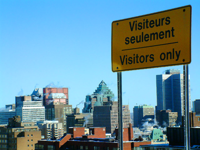
(1) COMPOSITION (CONTENT) � Very good. Sign is placed off center nicely. The city then nicely completes the photo. The relative size of the sign is very good.
(2) BACKGROUND � The city is nicely laid out with respect to the sign. The blue sky acts as good negative space.
(3) CAMERA WORK ,TECHNICAL � Focus & DOF look quite good.
(4) DIGITAL PROCESSING ,TECHNICAL � No real suggestions, looks good to me.
(5) MY OPINION ON THE PHOTO � Nicely chose sign and composition for the photo. The wording of the sign is humorous and eye catching. The major negative for this challenge would be the position of the sun and the lighting of the sign. The photo should have been taken with more light on the sign. That probably was the one item that cost you in the scoring.
Jim msp
|
|
 Photographer found comment helpful. Photographer found comment helpful. |
Comments Made During the Challenge  |
|
|
01/26/2003 06:39:11 PM |
| LOL funny! Good eye...good shot. |
|
|
|
01/25/2003 09:55:42 PM |
|
|
|
01/25/2003 09:42:06 AM |
| Humorous take on the challenge. Nice composition. I wisht the sign was just a bit brighter though. |
|
| Photographer found comment helpful. |
|
|
01/25/2003 07:51:54 AM |
| This is just really funny, great idea and perspective with the city behind the sign, the title helps also. The focus is good on the city, nice and crisp, but due to poor lighting/shadow on the sign it seems to be a bit grainy. The sign placement os good, grabs your attention yet allows for the view of the city, which is important on this shot. The horizon is also nicely placed on the lower third. The colors are nice, not eye catchingly brillant, but nice for a cityscape. 7. |
|
| Photographer found comment helpful. |
|
|
01/24/2003 05:30:00 AM |
| this photo could use a little clockwise rotation and a little more light on the sign |
|
| Photographer found comment helpful. |
|
|
01/23/2003 07:33:47 PM |
| perfect sky in the background. Is that sign on the top of a building? |
|
|
|
01/23/2003 04:39:58 PM |
| Funny title. I like you composition - the sign is well placed (perhaps just a little close to the tallest building under it), The shot of the city is an interesting one - lots of variety and the clouds of smoke / steam add an industrial feel to it. My biggest negative is that the sign is a little dark - I wonder if using a flash would have helped illuminate the sign since it was backlit by the sun. Well done. |
|
|
|
01/23/2003 06:12:15 AM |
| Hmmm... Somewhere in canada I'm guessing. Towards quebec maybe? Strange to read visitors only. Too much sky IMO. Not a bad shot though - Inspzil |
|
|
|
01/23/2003 04:21:56 AM |
| Nice composition, that sky really looks crispy blue. |
|
|
|
01/22/2003 10:16:00 PM |
|
|
|
01/21/2003 05:59:50 PM |
| Wish the buildings looked a little more upright, they look to be leaning to the left. I love the creativity and meets the challenge very well. |
|
| Photographer found comment helpful. |
|
|
01/21/2003 03:16:03 AM |
| my family have been here 100 years, so I don't agree, but I get it. |
|
|
|
01/20/2003 04:27:25 PM |
| Nice shot. From Avenue du Parc eh? It feels like -20 just looking at that picture. Good Luck! 8 |
|
|
|
01/20/2003 01:34:44 PM |
| One of the few that fit the challenge. Great!! |
|
|
|
01/20/2003 01:26:09 PM |
| Beautiful city and photo. Love the sky line and the blue sky. Strange sign. What does the top line say - a place for visitors to stay or park? Can't figure out how you got the sign photo to high up. But I like it. It's worth an 8 |
|
|
|
01/20/2003 09:38:57 AM |
Nice shot of Mtl! :o)
Too bad the sun wasn't shining on the sign though. The colors are crisp 6 |
|
Home -
Challenges -
Community -
League -
Photos -
Cameras -
Lenses -
Learn -
Help -
Terms of Use -
Privacy -
Top ^
DPChallenge, and website content and design, Copyright © 2001-2025 Challenging Technologies, LLC.
All digital photo copyrights belong to the photographers and may not be used without permission.
Current Server Time: 04/06/2025 10:44:20 PM EDT.