| Author | Thread |
Comments Made During the Challenge  |
|
|
10/12/2004 08:05:59 AM |
| the light looks a little uninspiring here |
|
|
|
10/09/2004 11:56:47 AM |
| there's no subject, needs color at least |
|
|
|
10/08/2004 08:03:42 PM |
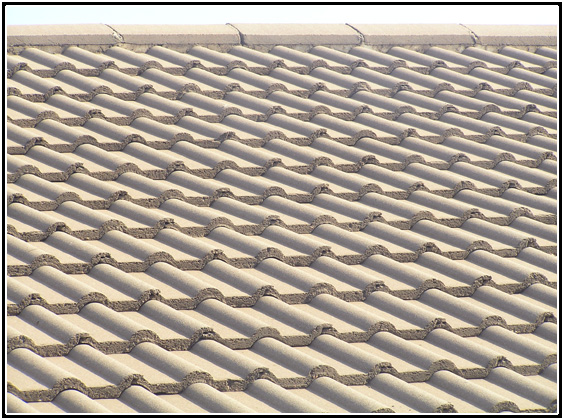
| Good abstact but maybe could use a focal point... Nicely exposed and good use of monochromatic . |
|
|
|
10/08/2004 11:01:38 AM |
| Terrific repetition. I would love to see a version "2" with the top edge cropped with just the tiles showing and see what that looks like, also. Good job!! Crisp lines, great lighting. |
|
|
|
10/07/2004 09:31:15 PM |
| looks like a hot and hazy day, very good pattern though...i'd like to see it without the roof line |
|
|
|
10/07/2004 04:20:21 PM |
| Perhaps this would have been better if the whole picture has been just the clay shingles - I find the ridge a little distracting. still, I like it. |
|
|
|
10/07/2004 03:25:00 PM |
| A really great photograph! I like the tone and angle of view, the focus is sharp. Like how the roof tiles appear to move when I scroll it for viewing. Fantastic lighting/shadows. The only thing I would have liked to see done differently, maybe, is to crop out the top roof line. It stops my eyes, is jarring. Then again, I know that leaving it in is the only way I would be able to identify the subject. Very well done! |
|
|
|
10/07/2004 10:50:45 AM |
| sky is distracting... nice idea |
|
|
|
10/07/2004 06:05:58 AM |
| Hurts my eyes, but i like it!! |
|
|
|
10/07/2004 12:54:30 AM |
| Thats good quality shot and good idea... wonder if you had to leave white part of sky. |
|
|
|
10/06/2004 07:03:31 PM |
| I think perhaps crop that cut off the roof line, leaving just the pattern of tile, may have worked better. Eye-catching design though! |
|
|
|
10/06/2004 07:20:19 AM |
| Cool patterns. Cropping out the sky might make it better though. |
|
|
|
10/06/2004 06:44:23 AM |
I would crop to the front edge of the top row of bricks.
great pattern |
|
 Photographer found comment helpful. Photographer found comment helpful. |
|
|
10/06/2004 04:22:29 AM |
|
| Photographer found comment helpful. |
|
|
10/05/2004 10:06:41 PM |
| Nice geographic patterns. I think this shot might look better with a bit more contrast, but it still came out really nice. Good job. |
|
| Photographer found comment helpful. |
Home -
Challenges -
Community -
League -
Photos -
Cameras -
Lenses -
Learn -
Help -
Terms of Use -
Privacy -
Top ^
DPChallenge, and website content and design, Copyright © 2001-2025 Challenging Technologies, LLC.
All digital photo copyrights belong to the photographers and may not be used without permission.
Current Server Time: 04/07/2025 01:12:53 PM EDT.