| Author | Thread |
Comments Made During the Challenge  |
|
|
01/16/2003 06:27:46 PM |
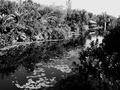
| I hate to say this but I really don't like the sepia color on this photo. It just doesn't work for me. It feels old instead of fresh. I think a straight black and white would have been much better and would have kept the timelessness of the scene. The composition is a little off. I would have framed the scene more to the left and down a bit to show the entire boat in the lower left corner. The mast that is sick up from the bottom edge is very distracting as well. This is a very beautiful location but I don't feel that you captured it as well as it could have been. 5 -Tim |
|
|
|
01/16/2003 01:47:10 PM |
| Nice photo, but would have liked to see more "land objects" in a landscape. |
|
|
|
01/16/2003 12:40:52 PM |
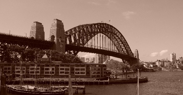
| Nice shot! Technically this is more of an architecture shot, but I've not dinged any of the other city scapes either, so I won't this one. (Who am I to say you could or couldn't get out to the backcountry...no wheels, not able, whatever) Sepia always makes me think of OLD and that bridge looks very old, but the towers behind it don't (mix doesn't feel good). Focus and lighting seem very good. Contrast is well done, too. 7 Swash |
|
|
|
01/15/2003 06:43:53 PM |
The brige is great and the angle you have chosen is also great. The house in the front dsturbes a little, it catches the viewers attention although it shouldn't. Choise of color and technicaly alos good.
However, to make me rate it higher, it should better fit the challenge: it's too close to the bridge, which dominates the picture. Too me landscape pictures have to give the feeling of space, openess and details (like the bridge) have to stand back. But that's just me. |
|
|
|
01/15/2003 02:00:43 PM |
| Good perspective and excellent choice on the color tones. Great pic! |
|
|
|
01/15/2003 09:44:43 AM |
| This pic is more architecture than landscape IMO. It is in any case a pretty good pic. I like the sepia tone - Inspzil |
|
|
|
01/15/2003 07:03:15 AM |
| I'm not too fond of the pink tint, but the shot looks very nicely done. Focus and clarity are great. The detail is amazing in the bridge. Looks like you did a great job leveling the photo. Placement of the bridge within the photo is nice, and lighting seems good. No hot spots or distracting shadows. That pole intruding from the bottom near the right corner is kind of out of place, but sometimes we take what we can get. Very nice view. Good luck in the challenge. |
|
|
|
01/15/2003 04:39:16 AM |
| I like the choice of Sepia here. Your composition is good as well. |
|
|
|
01/14/2003 10:13:32 PM |
| I like the composition of this picture very much. The foreground building works very well against the sloping bridge, the towers and the arch. The city on the right gives the picture picture closure as the bridge leads you right to it. Unfortunately, you seem to have overboard with the USM as your picture is full of sharpening artifacts. Sorry, can't give you full marks for it. |
|
|
|
01/14/2003 08:42:19 PM |
| The sepia toning works well here, along with the crop and placement of the elements, except for one that keeps getting in the way... the flag pole. There's likely a different angle/viewpoint that could have been used that would have excluded this small distraction. Well, at least you can always clone it out :) |
|
|
|
01/14/2003 10:52:18 AM |
| wow, you really managed to make this photo look old, except maybe for some of the high-rises in the background. sepia works well here. i like how the bridge leads the eye through the photo. the flag staff in the foreground (right 1/4) is a tad distracting, but i don't know if you could've positioned yourself so that it wasn't in the picture. i guess you met the challenge, even though my definition would include more nature than buildings, but i definitely still see the intent. nice photo :) |
|
|
|
01/13/2003 11:49:15 PM |
| I guess I wonder if this is technically a LANDscape, because I see more water than land, and the bridge is the prominent subject. I like the picture, I only rate it low because I don't think it fits the category properly. In "architecture" or "bridges" I would rate it much higher. |
|
|
|
01/13/2003 07:10:32 PM |
| Ahhh Sydney Harbour Bridge. One of my fav landmark places. I like the use of sepia here and the composition is great. It's hard to photgraph that ole' bridge and get it all in, however you have done an excellent job. Well done and GL. |
|
|
|
01/13/2003 05:41:54 PM |
| Try heading to Taronga Zoo for a shot - there's a beautiful one. Not crazy abou this angle. |
|
|
|
01/13/2003 05:29:18 PM |
| This is a great photo but I would like it better in color. The flags at the bottom are a bit distracting but maybe there was nothing you could do about it. Nice Job |
|
|
|
01/13/2003 05:05:28 PM |
| Sepia tone works really well in this photo - the old bridge, with the sailing ship in the foreground suit it. It looks like the framework for the fireworks is still on the bridge, but it doesn't distract that much. Well done. |
|
|
|
01/13/2003 09:37:41 AM |
| I like the old fashioned sepia look |
|
|
|
01/13/2003 07:52:45 AM |
oh man i can see how clear the sky is .. it must have been a fantastic blue colour
and then the water as well, will be nice to see how it does, i just would have loved to have seen it in colour. 5 |
|
|
|
01/13/2003 05:37:47 AM |
| I think the sepia effect is a little overdone. |
|
Home -
Challenges -
Community -
League -
Photos -
Cameras -
Lenses -
Learn -
Help -
Terms of Use -
Privacy -
Top ^
DPChallenge, and website content and design, Copyright © 2001-2026 Challenging Technologies, LLC.
All digital photo copyrights belong to the photographers and may not be used without permission.
Current Server Time: 02/01/2026 10:08:05 AM EST.