| Author | Thread |
|
|
01/15/2003 11:00:42 PM |
Greetings from the Critique Club :)
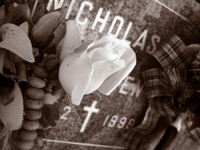
I'm not familiar with this song, but I can definitely relate your image to the title you chose :) The flower blossom is the first thing that catches my eye in this photo. I think that element of this photo is well-placed in the composition as well.
The toning here seems slightly odd for me for some reason, but I used a similar toning on a similar photograph recently, and I'm not sure why. The sepia toning is traditionally used for two reasons. #1- to add warmth and #2- add a sense of antiquity.
To me, this particular photo, even though it has a flower blossom as a primary subject, conveys a cold and dark feeling which is in slight contrast with the toning, in my opinion. The dates on the tombstone don't show any sense of antiquity to help support the toning of the photo.
I really do like the tilted compsition on this photo. The tilt adds a nice off-balance element that fits very well with the entire theme of this photograph. That was a great touch :)
Keep up the good work :)
John Setzler
|
|
Comments Made During the Challenge  |
|
|
01/10/2003 01:17:15 AM |
| Excellent. I love the composition and tone in your image. Very well done. 10 :) |
|
|
|
01/09/2003 02:57:40 PM |
| one of my favorite songs. i like the tilt, it adds a dramatic element to the photo. compostion seems a bit busy. |
|
|
|
01/07/2003 09:43:12 AM |
| much, much too cluttered. Not enough contrast and everything fades into the thing beside it. Can't really tell where one ends and the next begins. Not everything is in focus, especially on the right side. 4 PTL |
|
|
|
01/07/2003 12:32:30 AM |
| I like the sepia tones. Very good dof. I like the framing. Great shot. |
|
|
|
01/06/2003 09:11:17 PM |
| I think the shot should have been a bit wider |
|
|
|
01/06/2003 05:43:29 PM |
|
Home -
Challenges -
Community -
League -
Photos -
Cameras -
Lenses -
Learn -
Help -
Terms of Use -
Privacy -
Top ^
DPChallenge, and website content and design, Copyright © 2001-2026 Challenging Technologies, LLC.
All digital photo copyrights belong to the photographers and may not be used without permission.
Current Server Time: 02/01/2026 10:38:28 AM EST.