| Author | Thread |
|
|
03/07/2013 07:29:08 PM |
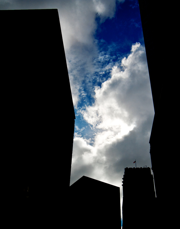
| that inky blue and the sharp shapes... |
|
 Photographer found comment helpful. Photographer found comment helpful. |
Comments Made During the Challenge  |
|
|
03/07/2013 09:46:57 AM |
|
| Photographer found comment helpful. |
|
|
03/04/2013 06:59:10 AM |
| interesting use of negative space for contrast...probable more effective than the detail of the buildings for the 'art' aspect. |
|
| Photographer found comment helpful. |
|
|
03/03/2013 12:50:08 PM |
| I like what you have seen here. Nice silhouette capturing the shapes of the city and the framing of the sky is interesting. I think a couple things to improve upon is to make sure the framing goes all the way to the top of the frame on the left and expose for the brightest portion of the sky. I think the composition would improve with the framing up to the top on all three sides. Also some of the cloud has lost detail due to being over exposed. You have done well to reduce the scene to it's basic elements. |
|
| Photographer found comment helpful. |
Home -
Challenges -
Community -
League -
Photos -
Cameras -
Lenses -
Learn -
Help -
Terms of Use -
Privacy -
Top ^
DPChallenge, and website content and design, Copyright © 2001-2025 Challenging Technologies, LLC.
All digital photo copyrights belong to the photographers and may not be used without permission.
Current Server Time: 04/08/2025 05:56:08 PM EDT.