| Author | Thread |
Comments Made During the Challenge  |
|
|
01/12/2003 07:38:23 PM |
| Unless we're thinking of different songs, I think you have those lines reversed...still a good idea. |
|
 Photographer found comment helpful. Photographer found comment helpful. |
|
|
01/12/2003 07:32:56 PM |
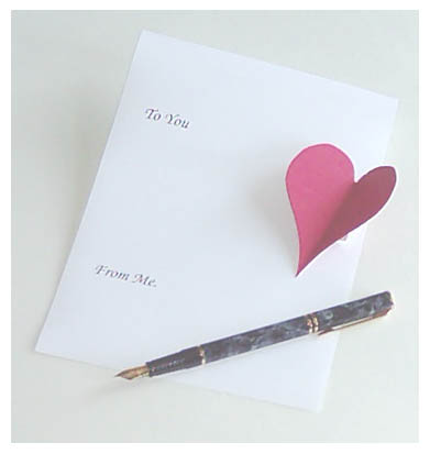
| Seems like the colors here are muted, like the brightness was over brightened. Makes it look like there's a haze over the shot. I like the idea, and your focus and clarity are good. It does portray the song, and lighting is good as well. Good luck in the challenge. |
|
| Photographer found comment helpful. |
|
|
01/12/2003 07:04:12 PM |
| A little overexposed. jgillard5 |
|
| Photographer found comment helpful. |
|
|
01/10/2003 04:09:42 PM |
| Seems a little overly pale, even the pen. (Did you lighten the brightness?) Maybe try re-saturating the color afterwards (If this is what you did) 6 Swash |
|
| Photographer found comment helpful. |
|
|
01/08/2003 12:31:10 AM |
| The image looks a little washed out. Perhaps you were working without enough light. Also perhaps a different background (like a wooden desk) might have made the sheet of paper stand out more. The comosition of objects is good though. |
|
| Photographer found comment helpful. |
|
|
01/07/2003 11:10:27 PM |
| rather washed out. White paper on off-white background? Can't tell if is out of focus or if appears this was because it is washed out. Not too sure how they feel about this note here either. I think they look down on it. Photo wise though I can only give it a 4. PTL |
|
| Photographer found comment helpful. |
|
|
01/06/2003 11:58:12 PM |
| Nice pen...needs a fancier "heart" to go with it. |
|
| Photographer found comment helpful. |
|
|
01/06/2003 10:56:00 PM |
| neat idea. seems out of focus maybe, .. there seems to be a haze. |
|
| Photographer found comment helpful. |
|
|
01/06/2003 12:41:49 PM |
| Washed out on purpose? Or did you pump the brightness too much? |
|
| Photographer found comment helpful. |
|
|
01/06/2003 10:53:17 AM |
| Unfortunately, this photo lacks punch. It could have stood more contrast, as well as a litlle more colour saturation. The soft focus works in this case, because of the mood represented. |
|
| Photographer found comment helpful. |
|
|
01/06/2003 07:35:30 AM |
|
| Photographer found comment helpful. |
Home -
Challenges -
Community -
League -
Photos -
Cameras -
Lenses -
Learn -
Help -
Terms of Use -
Privacy -
Top ^
DPChallenge, and website content and design, Copyright © 2001-2026 Challenging Technologies, LLC.
All digital photo copyrights belong to the photographers and may not be used without permission.
Current Server Time: 02/01/2026 11:45:24 AM EST.