Greetings from the Critique Club :)
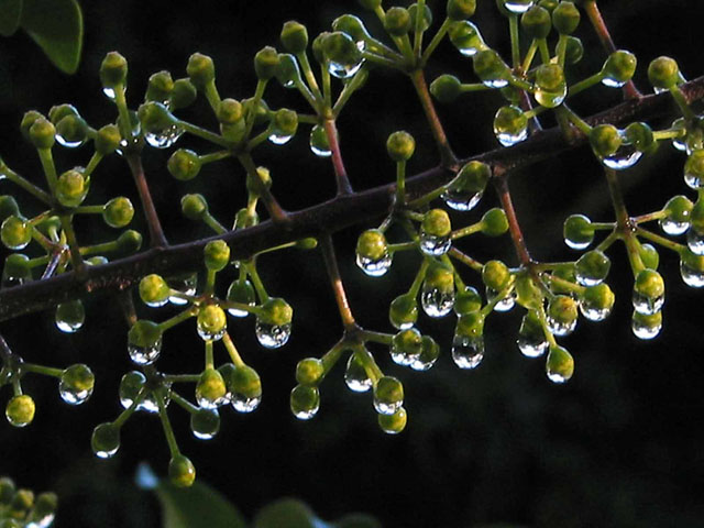
Rascal, this is an excellent photo to go along with your song title :) I particularly like water drops, so this photo works very well for me :) This is a peaceful image and it is definitely one that a viewer can get lost in very quickly.
The dark background really makes these water droplets stand out nicely. It creates just the right amount of contrast to make the drops really punch out at the viewer in this image.
I don't really know how to suggest much improvement on this image. A stronger diagonal composition would appeal to me more, but if you rotate this image, the water drops will not be conforming to the laws of gravity. The light distribution on your subject seems to be slightly uneven also. It appears to be much brighter on the bottom of the subject. In a case like this, if you can solicit help from a friend, hold a piece of white paper above your subject and it will reflect some light back and help create more even lighting. Sometimes, this can improve your overall image quite a bit.
The final element that I see here that could make this image stronger is the sharpness. The detail in this macro shot seems a little 'soft' overall. I would have tried to use the sharpen filter in photoshop to make this one nice and crisp.
Finally, I noticed that you did not post any exposure information for this image. This is not a problem, but it can be useful for a critique club critique. I may be able to look at this information and tell you how to modify it to make a better exposure if you post the information for us :) If you do not know how to get this information from your image, let me know. I will be glad to assist you! As a matter of fact, I think I will post a note in the forums about this sometime today...
Cheers and keep up the good work :)
John Setzler
|