| Author | Thread |
|
|
01/11/2003 08:25:46 PM |
"Critique Club Comment"
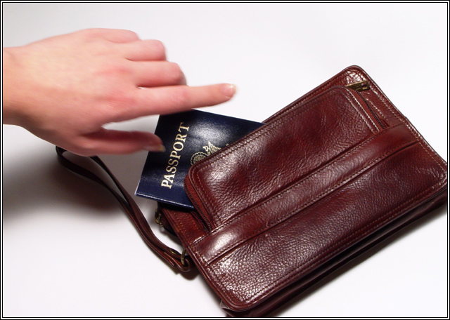
COMPOSITION- The way you have placed everything is good. I like that you've filled the frame and don't have a whole lot of extra space in the shot. You could have cropped just a little less to get the whole bag in.
BACKGROUND- it is white
CAMERA WORK- Your exposure is great.
DIGITAL PROCESSING- you've compressed this good and your levels seem fine.
MY OPINION- I thought this photo was just average during the voting. I think it would have a little more impact if you would have the hand holding the passport and more in focus. Or what I think would be neat if you could have slowed down the shot and had the hand taking the passport out of the bag. |
|
 Photographer found comment helpful. Photographer found comment helpful. |
Comments Made During the Challenge  |
|
|
01/05/2003 01:50:33 PM |
| The hand is out of focus and doesn't look like it is really going to pick up anything or putting anything in, just kinds placed in the photo, from the angle of it. Maybe if the passport were actually in the hand. I like the simpleness and how uncluttered the shot is. It is very well focused otherwise and I basically like it. Personally I wouldn't have cropped off the corner of the wallet. The shadow is harsh. Maybe use a light on that side aimed at the hand and parallel with the arm. Otherwise a good photo. 7 PTL |
|
|
|
01/04/2003 08:24:36 PM |
| missing originality and focus |
|
|
|
12/30/2002 04:02:30 PM |
| It's a shame the hand is slightly out of focus |
|
Home -
Challenges -
Community -
League -
Photos -
Cameras -
Lenses -
Learn -
Help -
Terms of Use -
Privacy -
Top ^
DPChallenge, and website content and design, Copyright © 2001-2025 Challenging Technologies, LLC.
All digital photo copyrights belong to the photographers and may not be used without permission.
Current Server Time: 04/07/2025 01:00:18 PM EDT.