| Author | Thread |
|
|
01/14/2003 09:42:33 PM |
Critique Club Comment :
Sorry this is so late... It's been a bad week :)
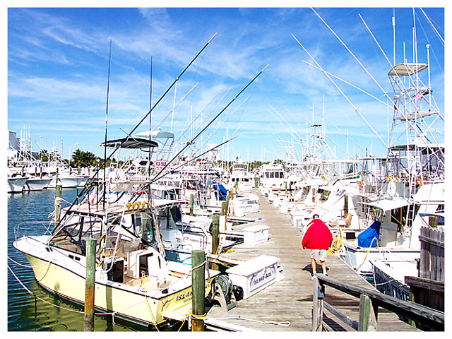
Composition : A lot of what I'm going to say about composition assumes that you can hover over water. Please feel free to disregard this if that isn't among your talents :) If this could have been taken from about 3 or 4 feet to your left, I think it would have made the dock a strong diagonal into the shot under the diagonals of the poles of the boats... (I don't know if that makes sense or not). As it is the dock slants slightly right to left (from bottom to top) and doesn't generate the same WoW that either a straight line or a more dramatic slant might have. Again, if you haven't learned to hover, ignore this :) I do like the Red jacket dead on the third point. I hadn't noticed the feet until Gordon mentioned it, but I think he has a point.
Exposure : My monitor had the opposite problem, which I was able to correct largely by stealing my wife's monitor. Knowing that your monitor shows darker then standard, you may want to adjust your pictures to be a little darker than you would like. This shot did suffer from the exposure.
Focus / DoF : Focus was well done. No problems.
Post Processing : Last word on your monitor problem... Put this shot on a floppy and bring it to a computer store. Tell the salesman you want to look at monitors and look at this on a different monitor. It may help you adjust your future shots.
Challenge / Interest : Challenge clearly met.
My opinion : I'd like to see this shot again if you could process it on a different monitor. I think it has great potential with the strong lines and the jacket. |
|
|
|
01/12/2003 08:47:13 PM |
| CC: Well, this is obviously a harbour. I like how you've used the pier to lead the eye out into the flotilla of boats. It seems slightly over exposed/ over contrasty on my screen - a lot of blown out white highlights, but to me that evokes the blinking, bright sun near the ocean. The cloud formations have made this more interesting too and I like how all the fishing rods/ masts etc lead back into the center of the frame, creating triangles all over the place. The person in the red coat adds just enough interest to lift this, although perhaps a fraction later would have left his feet in the frame, rather than hidden behind the walkway railing ? |
|
|
|
01/06/2003 10:01:29 PM |
| I thank everyone who commented on my picture. You all agree that it is overexposed. It's too bad that I can't see that on my monitor. I'm not sure what I can do about my monitor. But I really appreciate you all letting me know the problem. :-) |
|
Comments Made During the Challenge  |
|
|
01/05/2003 08:45:50 PM |
|
|
|
01/05/2003 05:04:40 PM |
| Very sharp - but way too bright. Intentional - artistically? The whiteness on the boats makes them all merge into each other. Great composition though! |
|
|
|
01/05/2003 12:31:34 AM |
| Really interesting but a bit too much light |
|
|
|
01/04/2003 09:39:59 AM |
| The crowded marina gives a promise of activity and adventures at sea. The picture is a bit too bright though and the motive isn't that original. |
|
|
|
01/03/2003 01:20:07 PM |
| Looks like a postcard, a bit overexposed or too bright, though. |
|
|
|
01/02/2003 02:13:13 AM |
| I think a bit overexposed but I like the picture anyway. |
|
|
|
01/01/2003 08:47:20 PM |
| Too bright. All the white on the boats is blown out. Nice depth and good focus. A very tight shot making it look busy. Either darken or lower the contrast on this. Reducing the gamma might help. It's worth a try. PTL 5 |
|
|
|
12/31/2002 08:28:52 AM |
| Very crowded with detail. |
|
|
|
12/31/2002 02:50:22 AM |
| Looks bright and oversaturated (especially the distant boats). Nice colour and detail though. |
|
|
|
12/30/2002 11:00:05 PM |
| Just a bit over exposed. Looks like a nice place to be though. |
|
|
|
12/30/2002 09:04:40 PM |
| Nice photo, although a little to much glare. Perhaps a polarising filter would help (unless you already had one on?). Nice framing though. |
|
|
|
12/30/2002 03:06:03 AM |
| I almost had to sheild my eyes from the brightness! I like all of the boats, though. |
|
Home -
Challenges -
Community -
League -
Photos -
Cameras -
Lenses -
Learn -
Help -
Terms of Use -
Privacy -
Top ^
DPChallenge, and website content and design, Copyright © 2001-2026 Challenging Technologies, LLC.
All digital photo copyrights belong to the photographers and may not be used without permission.
Current Server Time: 02/01/2026 10:29:20 AM EST.