Critique Club Comment :o)
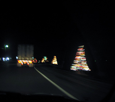
Composition:
There's a lot of dead (ie empty) space in this shot, which puts the majority of the lights in view into the middle third of the frame. That said, the while lane marking leads the eye from the bottom into the centre of the image, which is good.
Background:
Given that this was taken at night, there isn't much of a background to speak of, which helps highlight the lights in the shot (ie the main subjects). However, this does mean that the lights feel a little disjointed, lacking context to each other.
Camera Work:
This photo is obviously blurred, since (I presume that) the motion-blur is intentional to show the movement past the trees. Unfortunately, the vehicle that you were following is also blurred a little. My advice would have been to take the photo out of the side window as you went past the trees, and/or to use a longer shutter setting if possible, so that the motion trails are longer and thus more pronounced - which would also help link one area of the shot to another.
Post-Processing:
As you haven't provided any details along with this shot, I can really only guess at the post-processing involved, but perhaps playing with the levels would have helped richen the darkness and the colours, or brought out other features that were too dark originally. In addition to this, I personally always try to get at least one dimension to hit close to the 640 pixels limit, so that the viewer can see as much detail as possible. Whether it was intentional or not, your choice of the smaller image size means that there is less to see.
My Opinion:
The idea and subject was good (I'd considered doing a similar shot myself), but the choice of shot, poor framing/cropping, and the unusually small image size really let it down.
If you have any questions about this critique, please feel free to PM me about it.
Message edited by author 2003-01-09 05:37:23. |