| Author | Thread |
|
|
04/23/2012 02:27:58 PM |
Greetings from the Critique Club :)
Composition:
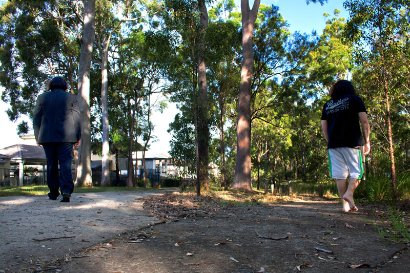
It's ok although something seems a tad wrong, I can't quite put my finger on it but I wonder if the scene is actually like this - to comply with the rules (as I understand them) you would have had to have taken the shot of the two people with the camera in the same position and for the scene to be one - to my eye it looks like the fork might be two different locations although I could be way off the mark :)
Technicals:
Assuming the scene is a single scene capture and for the purpose of the critique I will assume it is one complete scene, the shot is quite well taken, there seems to be fairly good focus but the left hand person seems a little flat.
Post-Processing:
I assume from your notes that there was not much editing done however I do think the shot would have benefitted from a little more contrast and quite a bit of sharpening, I am not sure if this would have bought more detail out in the main tree in the image though and for some reason I keep being drawn to this area and to me it seems there should be some detail in the bark but there is very little other than shadows so my eye is left wanting here especially.
My Opinion:
I like the idea I just think you need to work on the execution a little and then on your post processing, however this kind of shot could well see you getting Posthumous ribbons when the technicals are up to par.
Hope this was of some use, should you wish to discuss any part of the critique further please feel free to PM me.
Good luck in future challenges!
Mark |
|
 Photographer found comment helpful. Photographer found comment helpful. |
|
|
04/17/2012 09:44:42 PM |
Thanks for the comments people.
Pelican, I just used two images of the same person and fixed it all up in photoshop. |
|
Comments Made During the Challenge  |
|
|
04/17/2012 08:58:19 AM |
| This is actually wonderful. |
|
| Photographer found comment helpful. |
|
|
04/17/2012 04:54:48 AM |
| good one... staged or not, it doesn't matter. Love the low pov. |
|
| Photographer found comment helpful. |
|
|
04/16/2012 11:53:54 AM |
| Given a little more quality, this image could have really hit it on the nail for me. Maybe it's just a matter of sharpening - or the lack thereof, but something is lacking a bit technically. Conceptually I really like it though. |
|
| Photographer found comment helpful. |
|
|
04/15/2012 12:13:35 PM |
I don't like the colors that much, but the picture is very well directed.
May be simple black and white could have helped it, I'm not sure.
Anyway, great concept. |
|
| Photographer found comment helpful. |
|
|
04/14/2012 06:22:27 PM |
| Nice use of the theme. I like how the slender, young tree in the center defines the decision point - the beginning of each path. |
|
| Photographer found comment helpful. |
|
|
04/14/2012 03:06:28 AM |
| Twins? Body double? or Photoshop? Watch out for that fork in the road, a little less shadow on the figure on the left perhaps nut nicely done. |
|
| Photographer found comment helpful. |
Home -
Challenges -
Community -
League -
Photos -
Cameras -
Lenses -
Learn -
Help -
Terms of Use -
Privacy -
Top ^
DPChallenge, and website content and design, Copyright © 2001-2025 Challenging Technologies, LLC.
All digital photo copyrights belong to the photographers and may not be used without permission.
Current Server Time: 04/09/2025 07:40:34 AM EDT.