| Author | Thread |
Comments Made During the Challenge  |
|
|
09/05/2004 11:03:36 AM |
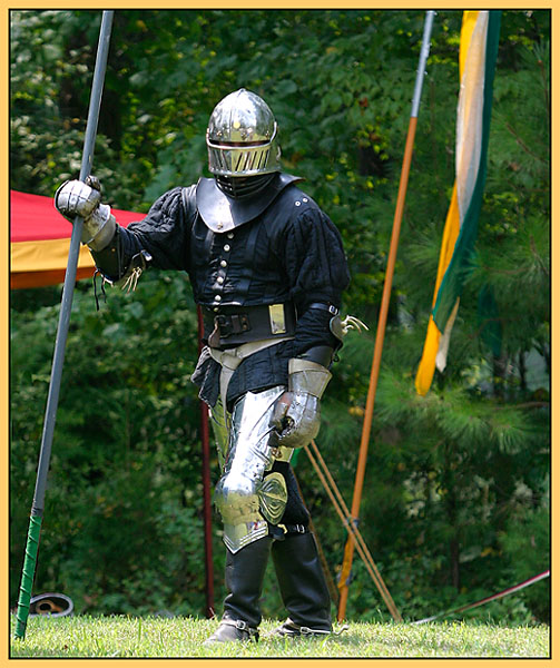
| I think I might have edited out some of the unnecessary poles on the background. Otherwise he certainly is proof. |
|
 Photographer found comment helpful. Photographer found comment helpful. |
|
|
09/05/2004 03:21:14 AM |
| Excellent shot. Great focus and choice of background. Feels like we are back in the days. |
|
| Photographer found comment helpful. |
|
|
09/04/2004 07:49:42 PM |
| it sems that metal is the hardest thing to get the lighting correct for. little too much reflection on the helmet and thigh. You may have been able to adjust the angle slightly and thus bringing out the detail in the silver armor but then again this may have been one of those situations you got the best angle you could. Great photo. |
|
| Photographer found comment helpful. |
|
|
09/04/2004 05:24:37 AM |
| Love it. Fits right into the challenge, well composed, & focused. 10 |
|
| Photographer found comment helpful. |
|
|
09/03/2004 04:09:32 PM |
| I really like this and am giving it a good score. I think a little more attention to the overall photo (background, how it interacts with the subject as well as the subject's pose and position) would have made it even better. |
|
| Photographer found comment helpful. |
|
|
09/03/2004 06:43:42 AM |
Borders are not usually my favourite, but this one compliments a fine image quite well.
Great job. |
|
| Photographer found comment helpful. |
|
|
09/01/2004 07:57:45 PM |
| I thought this was a very nice shot. |
|
| Photographer found comment helpful. |
|
|
09/01/2004 02:08:18 AM |
| I think a neutral black or white border would look better on this photo. Actually, putting the whole thing in black and white would look pretty good I think. Did you try cropping in closer on the knight? |
|
| Photographer found comment helpful. |
|
|
08/30/2004 08:46:08 AM |
| like the costume, needs something more for the composition. maybe a horse. |
|
| Photographer found comment helpful. |
|
|
08/30/2004 05:39:46 AM |
| He looks ready to go medieval on someone! Great pic! |
|
| Photographer found comment helpful. |
|
|
08/30/2004 05:27:59 AM |
| One common suggestion in composition is to never have objects leading your eye out of the photo. In this case the background flag is a significant subject, yet its partial presence in the frame becomes distracting. Similarly, the red/yellow corner of the tent to the knight's side makes us wonder where the rest of it is rather then focusing on the more intricate details of the knight's armor. I certainly don't suggest blindly following rules in photography, but in this case I believe they would help you to compose a stronger image. |
|
| Photographer found comment helpful. |
|
|
08/29/2004 09:48:56 PM |
| sca? ahh I miss the days of heavy weapons combat... what kingdom was this taken in? |
|
| Photographer found comment helpful. |
|
|
08/29/2004 08:37:15 PM |
| How lucky are you for finding or having something like this around to shoot during "Fairy Tale" week? Great shot, but I have a suggestion. How about a closer cropping on the knight? This would help eliminate more of the distracting flag in the background, and help the viewer focus better on the subject. Your focus from a distance is very nice as well. |
|
| Photographer found comment helpful. |
Home -
Challenges -
Community -
League -
Photos -
Cameras -
Lenses -
Learn -
Help -
Terms of Use -
Privacy -
Top ^
DPChallenge, and website content and design, Copyright © 2001-2025 Challenging Technologies, LLC.
All digital photo copyrights belong to the photographers and may not be used without permission.
Current Server Time: 04/07/2025 01:08:16 AM EDT.