| Author | Thread |
|
|
09/09/2004 05:00:13 AM |
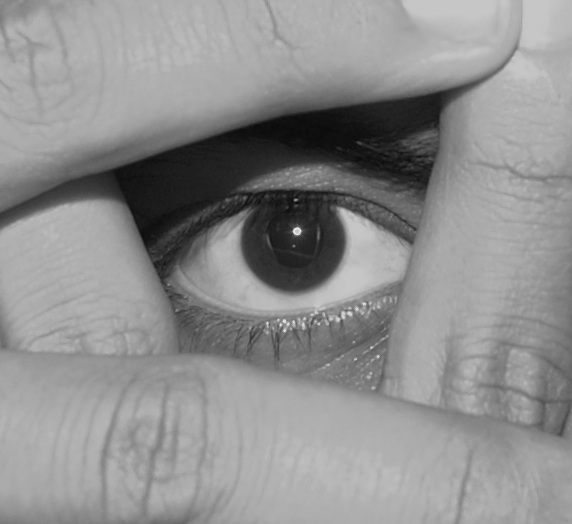
| I realized only after i posted and comments started coming in that all this rucus about flatnees is because I have a laptop and the colours etc are really different from a plain old monitor even after caliibration using adobe gamma. I will take care next time. Thanks for all ur comments. |
|
Comments Made During the Challenge  |
|
|
09/07/2004 07:52:01 PM |
This was one of my plans for this contest ...but was lazy :-(
|
|
|
|
09/07/2004 04:09:58 PM |
| nice pic. maybe it could have been a bit darker? |
|
 Photographer found comment helpful. Photographer found comment helpful. |
|
|
09/07/2004 03:39:07 PM |
|
|
|
09/07/2004 09:17:58 AM |
|
|
|
09/06/2004 09:22:56 PM |
| An interesting take on the challenge. Well shot for B&W. |
|
|
|
09/06/2004 02:16:19 AM |
Love the concept, love the composition, love the choice of b/w for the treatment, but it's a little flat. Needs more contrast...
TC |
|
| Photographer found comment helpful. |
|
|
09/04/2004 12:43:18 PM |
| The idea is good and the image is ok. Would have liked better contrast, f.inst. bye fideling with the levels |
|
| Photographer found comment helpful. |
|
|
09/02/2004 09:42:15 PM |
| Interesting EYEdea.... ;-) |
|
|
|
09/02/2004 11:22:13 AM |
| Good composition, sligtly out of focus (the eye). |
|
| Photographer found comment helpful. |
|
|
09/01/2004 11:02:13 PM |
| Fun idea. You might try darkening the darks and lightening the highlights for more contrast. Nice focus on the eye. |
|
| Photographer found comment helpful. |
|
|
09/01/2004 08:59:50 PM |
| Good concept and cropping but the lighting and tone are rather dull. |
|
| Photographer found comment helpful. |
|
|
09/01/2004 08:17:29 PM |
|
|
|
09/01/2004 01:58:39 PM |
|
|
|
09/01/2004 08:45:20 AM |
| Good idea. Technically, it could've been executed better. The photo seems to be muted and drab, lacking any real highlights (white) except for the tiny reflection in the eye. I would have liked to see more contrast in the image but 90% of this photo is midtone. |
|
| Photographer found comment helpful. |
|
|
09/01/2004 03:16:46 AM |
| i like this idea good photo. Maybe you could have increased the contrast in it though to bring out the textures a little more? just my taste though but good shot |
|
| Photographer found comment helpful. |
|
|
09/01/2004 01:31:17 AM |
| I would have preferred to see something other than fingers for the frame. |
|
| Photographer found comment helpful. |
|
|
09/01/2004 12:42:04 AM |
| Extremely creative.. absolutely magnificent shot. I personally believe that this embodies the idea of this challenge completely. |
|
| Photographer found comment helpful. |
Home -
Challenges -
Community -
League -
Photos -
Cameras -
Lenses -
Learn -
Help -
Terms of Use -
Privacy -
Top ^
DPChallenge, and website content and design, Copyright © 2001-2026 Challenging Technologies, LLC.
All digital photo copyrights belong to the photographers and may not be used without permission.
Current Server Time: 02/01/2026 08:59:28 AM EST.