| Author | Thread |
Comments Made During the Challenge  |
|
|
12/29/2002 12:54:01 PM |
|
|
|
12/28/2002 11:47:30 PM |
|
|
|
12/27/2002 06:44:33 PM |
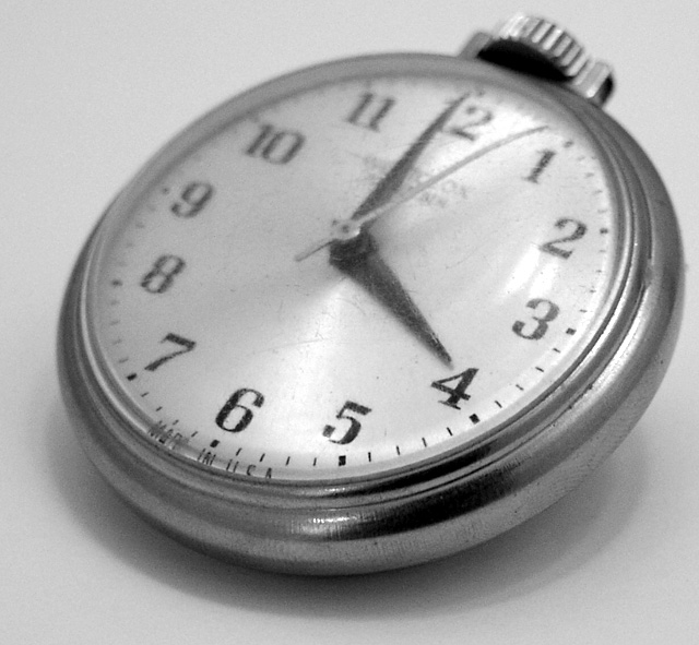
| Well, definately 4. At first, I wasn't fond of the focus, however, I see that it's right on the 4, and for this challenge, it's appropriate. The scratches are a bit distracting to me. I realize it's on old watch, but I think the scratches make the focus look even more off. I guess the important part is that the 4 is clear, and it is. Good luck in the challenge. |
|
|
|
12/27/2002 07:10:23 AM |
| Great job using the focus to draw you attention to the four. Very nice! |
|
|
|
12/24/2002 03:32:22 PM |
| What a lovely pocketwatch! It looks well-loved, or at least well-used. |
|
|
|
12/24/2002 02:38:02 PM |
| What a shame the crystal is all scratched and the case needs some heavy duty cleaning and shining. The numbers on the left top side are a little out of focus as is the stem. Good try and nice old watch. a 6 is still honorable. PTL |
|
|
|
12/23/2002 03:23:04 PM |
| The watch face is scratchy, maybe you should have used a sepia tone to enhance the feeling of age, as is you tend to like to see silver bight and shiney, so the stratches are distracting. |
|
|
|
12/23/2002 05:00:10 AM |
| This shot would work better in full focus. |
|
Home -
Challenges -
Community -
League -
Photos -
Cameras -
Lenses -
Learn -
Help -
Terms of Use -
Privacy -
Top ^
DPChallenge, and website content and design, Copyright © 2001-2025 Challenging Technologies, LLC.
All digital photo copyrights belong to the photographers and may not be used without permission.
Current Server Time: 04/07/2025 12:18:27 AM EDT.