| Author | Thread |
Comments Made During the Challenge  |
|
|
03/11/2012 04:56:00 PM |
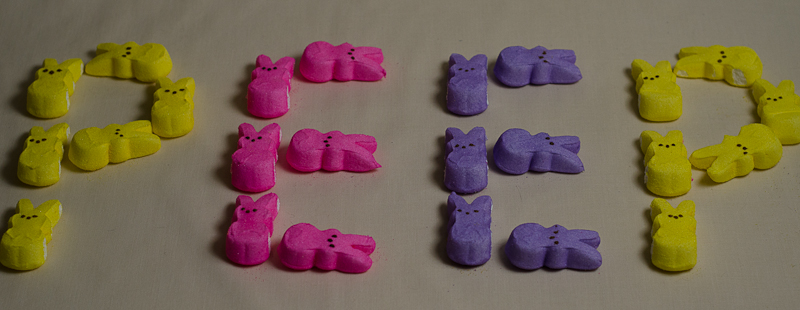
| I like the idea, the colours and it's funny but the composition and lighting are lacking here; the light overall is dull and could've used a boost on the highlights and midtones in PP. The cut-off edges of the yellow peeps at either side is distracting. |
|
|
|
03/06/2012 11:05:10 PM |
| Nice planning and colors. I would have chosen a top-down perspective (though I suck) to get the most out of your arrangement and colors. |
|
 Photographer found comment helpful. Photographer found comment helpful. |
|
|
03/06/2012 05:34:10 AM |
| A good palindrome. Would have liked to see more contrast in the colors, more vibrancy. They seem a little flat. The shadows are also a bit distracting. |
|
| Photographer found comment helpful. |
|
|
03/05/2012 12:55:12 PM |
Ha! Clever! I wonder how this could get more... pop! Perhaps some Curves and Brightness to make the background whiter and the colors more vivid.
(commenting only) |
|
| Photographer found comment helpful. |
Home -
Challenges -
Community -
League -
Photos -
Cameras -
Lenses -
Learn -
Help -
Terms of Use -
Privacy -
Top ^
DPChallenge, and website content and design, Copyright © 2001-2025 Challenging Technologies, LLC.
All digital photo copyrights belong to the photographers and may not be used without permission.
Current Server Time: 04/07/2025 03:01:44 AM EDT.