Greetings from the Critique Club!
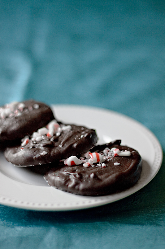
Ah feel yer pain...I see no reason why this gorgeous shot placed so low, I thought top 10 for sure. The comp is good, the focus is tack sharp, the complimentary colours are perfect for each other, and more to the point this shot made me want to gobble them down, which is why I gave you a 7 in voting! :-)
Maybe voters wanted to see the leading edge of the plate more in focus, who knows. But I do feel that there is just too much b/g and not much else floating around above the plate so a tighter crop is what I'd like to see. A shot like this needs more atmosphere, maybe if the fg looked like a tablecloth and in the bg was the hint of a kitchen or a kid's party, something like that, just to give it that little bit more atmosphere.
FWIW you may want to look at www.lcbo.ca (I think, it may be a .com addie). The two main photogs, James Tse and another guy whose name I don't recall offhand, specialise in food closeup shots like this that also have a sense of place to them.
Feel free to PM me,
Susan |