| Image |
Comment |
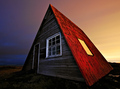
| 11/16/2008 10:29:28 PM |
Red Roofed Hut by orvaratliComment: Great lighting. Perhaps cropped a little tighter to the left as I found my eye wanting to look into the left. 9+ |
 Photographer found comment helpful. Photographer found comment helpful. |
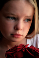
| 11/16/2008 10:25:38 PM |
by any other nameby animal_loverComment: A very strong portrait. The rose? is a little shapeless, esp on the right...I would have preferred it be a little more traditional in shape. |
| Photographer found comment helpful. |
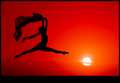
| 11/16/2008 10:22:34 PM |
I N S P I { R E D } by Breeee123Comment: A fav of mine/ I would have liked to see it without the black frame as the bottom black almost appears to be part of the frame |
| Photographer found comment helpful. |
| 10/28/2008 01:26:40 AM |
|
| Photographer found comment helpful. |
| 10/28/2008 01:16:38 AM |
|
| Photographer found comment helpful. |
| 10/28/2008 01:10:33 AM |
|
| Photographer found comment helpful. |
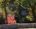
| 10/28/2008 01:05:28 AM |
Golden Leafby iztokvComment: I liked the simpleness of this image, but I felt it relied too much on the title to tie it to the theme |
| Photographer found comment helpful. |
| 10/28/2008 01:05:21 AM |
|
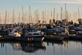
| 10/28/2008 12:58:42 AM |
Members Onlyby csalingComment: I would have liked you too work this image more. There is too much on the left and the redish tree is just too striking and hence distracting. Perhaps a portrait framing would have helped. |
| 10/28/2008 12:54:30 AM |
|
Home -
Challenges -
Community -
League -
Photos -
Cameras -
Lenses -
Learn -
Help -
Terms of Use -
Privacy -
Top ^
DPChallenge, and website content and design, Copyright © 2001-2025 Challenging Technologies, LLC.
All digital photo copyrights belong to the photographers and may not be used without permission.
Current Server Time: 04/10/2025 10:53:45 PM EDT.