| Image |
Comment |
| 08/17/2003 11:40:54 PM |
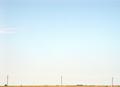
Telephone Poles and Tractorby ArtifactsComment: yes. excellent negative space. The sliver of land is just the right amount. What it really needs though, is a little less brightness, for a bit more of a blue hue instead of white down low. Just my pref though. I like it. Makes me feel like I'm cruising through Oklahoma |
 Photographer found comment helpful. Photographer found comment helpful. |
| 08/17/2003 11:39:13 PM |
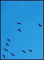
Broken Formationby buzzrockComment: I can't put my finger on it. I think maybe if the negative space was ahead of them, in the direction they are facing, that might work better. Nice catch though. |
| Photographer found comment helpful. |
| 08/17/2003 11:38:05 PM |
|
| Photographer found comment helpful. |
| 08/17/2003 11:37:21 PM |
Hi thereby eikidigiComment: maybe if he was a little more inward of that top corner.. it would still be a great use of negative space. Still, I love his expression-- doesn't look too happy with you! |
| 08/17/2003 11:35:46 PM |
prayby heidaComment: Great photo, perfect lighting. The negative space isn't really the clincher with this, but that doesn't matter, its just a great photo. |
| Photographer found comment helpful. |
| 08/17/2003 11:34:53 PM |
Stay! Leave it!by myqylComment: I know its a negative space competition, but I still want a little bit more of the dogs neck in it. I love his look though. |
| Photographer found comment helpful. |
| 08/17/2003 11:34:01 PM |
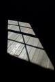
Shadows and Panesby christyrackComment: yes, good negative space, and the wood provides a great texture. Good that the light off of the floor boards is not blown out so you can still see the wood grain. |
| Photographer found comment helpful. |
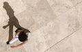
| 08/17/2003 11:33:07 PM |
Vertical Posture by GringoComment: not only great negative space, but also great use of a shadow, and great use of lines (in the ground). They really create a tilted feeling. 9 |
| Photographer found comment helpful. |
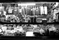
| 08/07/2003 03:30:51 AM |
Meatby hortopthComment: Thanks.. I've been planning on reshooting this from straight on- and not so blinding. It was sort of shot from the hip... then when I liked it, I thought I should do it a bit better. I thought I would throw it into the comp as is, but I didn't think it would take the beating that it did. I'll redo it for me. I still love it. If nothing else, it will go well in the kitchen. |
| 08/07/2003 02:17:49 AM |
|
| Photographer found comment helpful. |
Home -
Challenges -
Community -
League -
Photos -
Cameras -
Lenses -
Learn -
Help -
Terms of Use -
Privacy -
Top ^
DPChallenge, and website content and design, Copyright © 2001-2025 Challenging Technologies, LLC.
All digital photo copyrights belong to the photographers and may not be used without permission.
Current Server Time: 04/09/2025 12:49:12 PM EDT.