| Image |
Comment |
| 12/21/2003 07:05:31 PM |
|
 Photographer found comment helpful. Photographer found comment helpful. |
| 11/13/2003 04:00:46 PM |
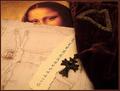
The Da Vinci Codeby sherComment: Just read this one a couple of days ago. You did a great representation and more importantly the photo stands alone as well in quality and interest. 10 |
| Photographer found comment helpful. |
| 11/12/2003 07:20:49 PM |
To the Lighthouse by dan_pendletonComment: What a great shot. I almost chose this book title myself so I know the book and can appreciate the aspects of this photo that make this such a perfect match. You really got lucky or patient with sky and the sand in addition to your choice of lighthouse. Everything comes together so nicely, the clarity, the composition of the shot, the colors and the perspective. 10 |
| Photographer found comment helpful. |
| 11/11/2003 06:13:42 PM |
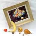
a matter of time and placeby indigo997Comment: I know that comments should be constructive but I think sometimes it is appropriate to just be appreciative. This is IMO the most beautiful photo in this collection. You have captured the best in color, tone and lighting for both classical still life and modern digital photography. I am very far from expert in photography but I'm quite schooled in the arts and one doesn't often have the opportunity to speak directly to the "artist" to express the inner joy his/her work has brought. 10 |
| 11/11/2003 06:03:23 PM |
escape from clicheby rhipsterComment: I am not certain that I like the background but I do think the concept and composition are very creative and fit the challenge beautifully. I understand that the white background may be intentional on your part to suit the irony of your subject (love the painting too) but it would prevent me from *hanging" this. That is just personal opinion. Your photo deserves a high score for creativity and suitability to subject if nothing else. |
| Photographer found comment helpful. |
| 11/11/2003 05:55:19 PM |
|
| Photographer found comment helpful. |
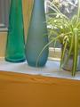
| 11/11/2003 05:52:10 PM |
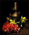
Blue Bottlesby richyComment: The colors here were immediately attractive and the choice of plant is wonderful. At first I didn't care for the angle but then as I studied it I found it more and more attractive and creative. Just exactly the same reaction one has in looking at art in the museums - when you look long enough to let all of the other images fade away and your focus and concentration becomes more narrowed the beauty of the image emerges. 8 |
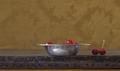
| 11/06/2003 04:57:35 AM |
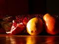
Cherriesby Sheila_LawsonComment: I would have liked this very very much if cropped. Still good color and perspective. |
| Photographer found comment helpful. |
| 10/14/2003 05:46:53 PM |
Palmer High Schoolby smellyfish1002Comment: I am interpreting Urban Landscape to be a photo that "feels" urban and this one does. What I like best is the fact that the students are walking as opposed to standing or sitting (and students are the best representation of any urban landscape). Outside of that the colors are crisp and the composition balanced in a way that is very pleasing. Nice photo. |
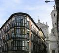
| 10/14/2003 03:12:39 AM |
Hidden Cathedralby sersalComment: What a fresh approach to capturing buildings in an older city with narrow streets and crowding of structures. ( ie. opposed to rooftop photo) I like the cropping very much because the piece left on the right side (which I'm pretty certain you included to capture the statue on the roof) is significantly contributing to the texture of this composition. Nice perspective. I'm not sure about including the lamplight on the top. It is a little distracting , although I understand that it gives horizontal perspective too. |
| Photographer found comment helpful. |
Home -
Challenges -
Community -
League -
Photos -
Cameras -
Lenses -
Learn -
Help -
Terms of Use -
Privacy -
Top ^
DPChallenge, and website content and design, Copyright © 2001-2025 Challenging Technologies, LLC.
All digital photo copyrights belong to the photographers and may not be used without permission.
Current Server Time: 04/15/2025 12:59:42 AM EDT.