| Image |
Comment |
| 02/03/2009 09:25:44 PM |
Arrival of Spring, a new beginning, a new hopeby PanksComment: Very pretty shot. I'm sure it looked great in person. I think the framing and lighting on this shot are both well done. The focus is a bit misplaced- the center branch midway up is quite sharp and all of the blossoms are soft. The focus could have been set right at first, and a windy day would have blown it right out of focus... or if you were using autofocus, your camera may have just focused on the center of the shot. If you can capture this again with the blossoms in focus, it could be great! |
| 02/03/2009 09:22:57 PM |
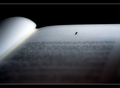
Chapter Oneby Anthony_D_ArcherComment: Great idea... great shallow DOF... I like the lighting a lot- there's quite a bit of character in the white spaces of the pages- instead of being all white and washed out... there's a nice quiet/soft life to it. Good job on the border too! My voting just started, but this is the first one that jumped out to me. Very well done! |
 Photographer found comment helpful. Photographer found comment helpful. |
| 02/03/2009 09:21:20 PM |
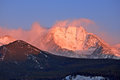
07:10 Alpenglow at Break-of-Dayby hahn23Comment: Nice. I love the blue sky with the golden/red tint on the fog- it just screams daybreak. Could have possible cropped a bit more off of the top and bottom (maybe knocked out the white at the bottom right so there's more contrast from the shadow to the main subject). Very cool capture (literally!... budum dum chingggg- bad pun- sorry). |
| Photographer found comment helpful. |
| 02/03/2009 09:18:40 PM |
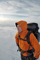
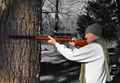
Looking forward to a long journeyby gthbComment: Looks like the beginning of a great trip. It's a nice shot- looks like it'd be a small corner photo in a hiking magazine. No real complaints, well lit, composed, great colors. Not completely unique or original, but a nice idea. Well done. |
| Photographer found comment helpful. |
| 02/03/2009 09:16:40 PM |
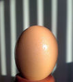
Which came first, the chicken or the egg?by Billy_PunterComment: I think Chicken. =o)
I like the texture on the egg and I love the background. It's a simple texture, not overpowering, but adds a lot. Would have been nice to not have the shadow in both the bottom corners. |
| 02/03/2009 09:14:41 PM |
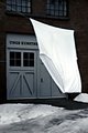
A Race of Very Big People...by raishComment: exposure of the door/ground/walls is good- but looks a bit blown out on the foreground subject. Great use of a close subject to give the perception of a massive size difference (with a title to match). A slow sync flash a longer exposure could have helped balance out the lighting in this one. |
| Photographer found comment helpful. |
| 02/01/2009 08:31:11 PM |
|
| 01/29/2009 03:56:14 PM |
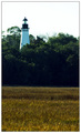
~ Lone Sentinel ~ (All Comments Welcome - ACW)by Ja-9Comment: It's a little blown out on top. It's hard with basic editing to get a well exposed field (which you have) and a well exposed sky/white sentinel in the same shot. Maybe try retaking this closer to dusk to get a more balanced shot? |
| Photographer found comment helpful. |
| 01/29/2009 03:55:09 PM |
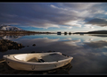
Serenity by BrinComment: great shot. a little foreground subject, but not too dominating- great sky/clouds/contrast- great reflection- great horizon to separate the water and sky. 9 from me! |
| Photographer found comment helpful. |
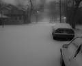
| 01/29/2009 03:52:37 PM |
Lonely Winter Nightby jpverkampComment: handheld shot? Nice shot, but the lights are all a bit blurry- since they're the most dominate, it gives the perception that the whole shot is out of focus (even though the cars look ok) |
| Photographer found comment helpful. |
Home -
Challenges -
Community -
League -
Photos -
Cameras -
Lenses -
Learn -
Help -
Terms of Use -
Privacy -
Top ^
DPChallenge, and website content and design, Copyright © 2001-2025 Challenging Technologies, LLC.
All digital photo copyrights belong to the photographers and may not be used without permission.
Current Server Time: 04/07/2025 06:20:08 AM EDT.