| Image |
Comment |
| 07/05/2009 02:45:51 PM |
Amandaby CoriLouComment: I am not sure where the focus lies here, as the woman seems to be a bit blurry all over. I also suspect that you over used some of the sliders in your photoediting software as there are obvious strange outlines surrounding the hand in the front. |
 Photographer found comment helpful. Photographer found comment helpful. |
| 07/05/2009 02:42:16 PM |
line of beautyby posthumousComment: Personally I think that the line from the thin branch isnt interesting enough to be the main motive. If the line was leading to something, something that catches the viewers focus - it would have been better. But in this case it is the flower, but it is to small and out of focus to make it interesting. |
| Photographer found comment helpful. |
| 07/05/2009 02:36:27 PM |
|
| Photographer found comment helpful. |
| 07/05/2009 02:32:16 PM |
Gardens and Cosmosby DistantColoursComment: I really like the kind of abstract pattern in this image! But personally I think the text (garden & cosmos) is distracting the viewer from the main point of interest - the lines and patterns. If possible, I would have tried to find an angle where sign does not becomes part of the image. |
| Photographer found comment helpful. |
| 07/05/2009 02:27:25 PM |
In Hidingby VidomaticComment: Personally i would crop a bit of the bottom of the legs, as there is a bit of shadow coming through there. I think the image would have been a little bit more edgy without them, and a bit more abstract as it gets harder to see that those actually are the legs. But I like the image never the less! |
| Photographer found comment helpful. |
| 07/05/2009 02:24:55 PM |
Dropletsby ankursomaniComment: The image looks grainy, and over saturated. I suspect that you over used the sliders for contrast, saturation and perhaps some of the lighting levels as well. |
| Photographer found comment helpful. |
| 06/26/2009 04:06:35 PM |
His favourite play spotby ShazbutComment: You should generally avoid using the internal flash unit of the camera. It creates such a harsch shadows, and overexposes the subject - washing out the full color potential. |
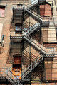
| 06/26/2009 03:59:07 PM |
Midday Ascensionby JeileenComment: Interesting staircases. But I think this image would really have benefited from not having the harsch shadows on the walls. It becomes hard to distinguis the shadows from the actual staircases. Therefore it would have been better to wait for the sky to be more clouded - making the lightsource softer. |
| Photographer found comment helpful. |
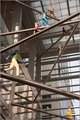
| 06/26/2009 03:33:06 PM |
As seen from belowby roachmotel3Comment: Perhaps this photo would be more interesting if you would lower the exposure level, making the image more abstract and also with the effect of trying to make the dummies darker - making the viewer believe that these dummies could actually be real people! Another way of making the dummies come more "alive" is perhaps to try to shoot the image when the sun is in the background, and making the dummies come out in silhouette. |
| Photographer found comment helpful. |
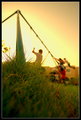
| 06/26/2009 03:22:51 PM |
Fun in the sunby gysComment: Great! Beautiful color tones and interesting composition. Good "energy" deriving from the blurry kids. |
| Photographer found comment helpful. |
Home -
Challenges -
Community -
League -
Photos -
Cameras -
Lenses -
Learn -
Help -
Terms of Use -
Privacy -
Top ^
DPChallenge, and website content and design, Copyright © 2001-2025 Challenging Technologies, LLC.
All digital photo copyrights belong to the photographers and may not be used without permission.
Current Server Time: 04/07/2025 05:30:09 AM EDT.